
Search the Blog
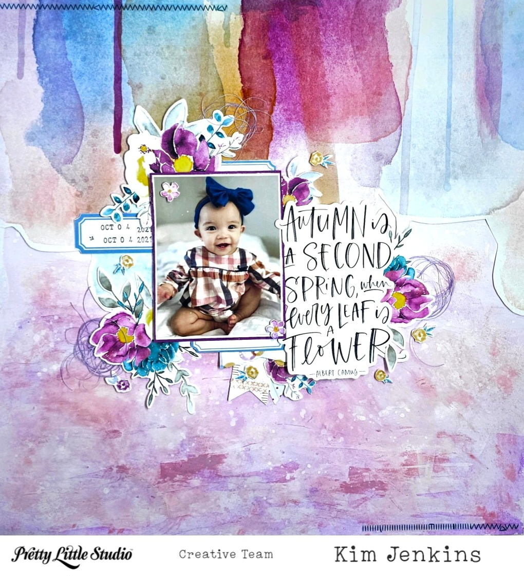
Hi Pretty Little Studio friends, it's Kim and I'm back today with a layout using the gorgeous Grateful Heart collection. My granddaughter's dress was perfect for this collection.
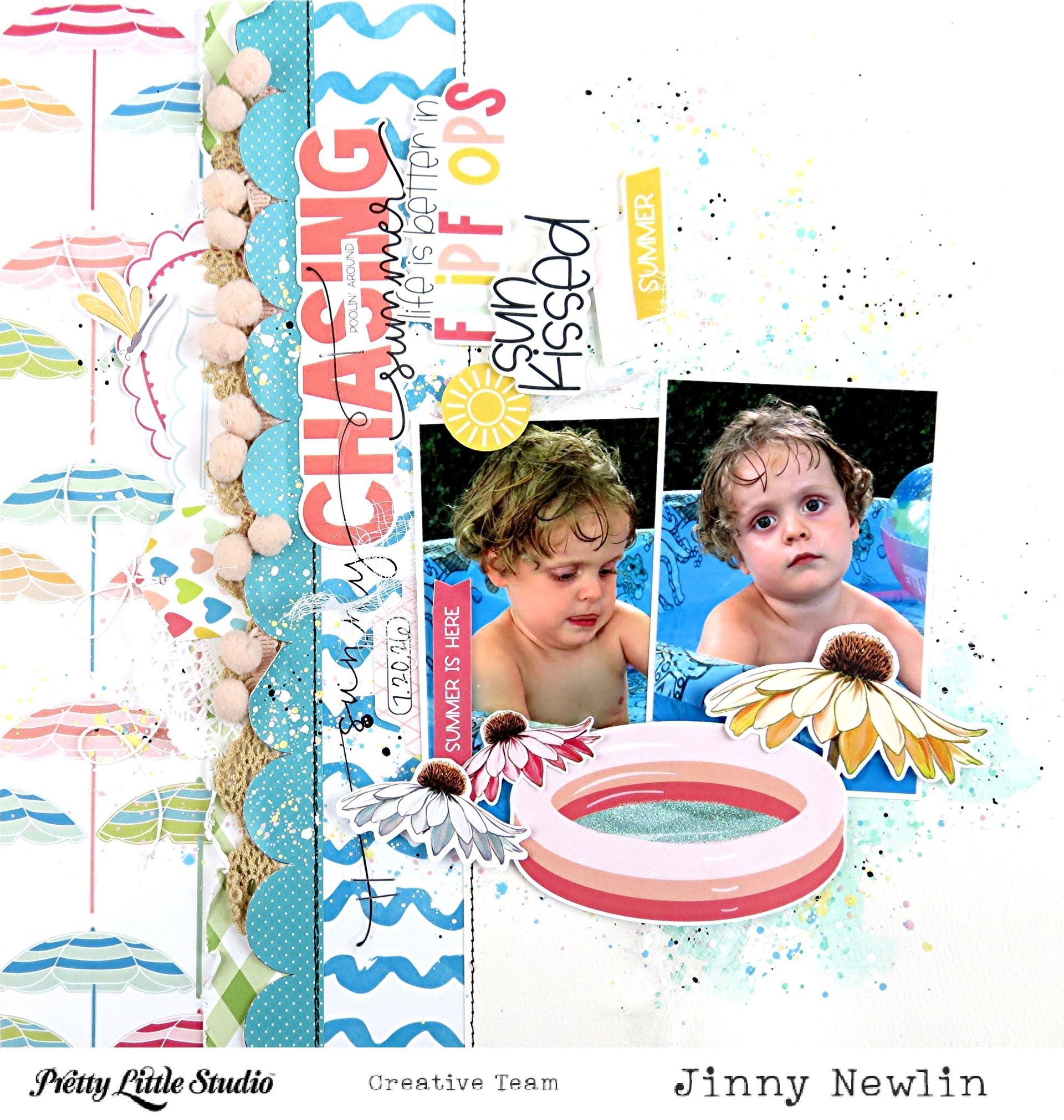
Hey, y'all! It's Jinny here today with another page, inspired by the Hey Summer Collection , as promised; and we're still getting use out of our little, backyard pool in my neck of the woods, so it still seems fitting weatherwise.
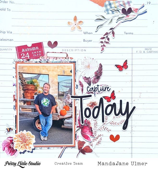
Hey Scrappy Friends! MandaJane with you today. One of my all-time favorite collections from Pretty Little Studio is the fall themed Ginger Snap collection. It has been my favorite for literally YEARS! Now that PLS is releasing an all new autumn themed collection called Heartwarming, I've decided to stop hoarding my Ginger Snap supplies and actually get them into my albumns! This photo is one of my husband last year at our Halloween Nights of Horror Downtown. I figured since the first day of fall was yesterday, we are allowed to start showing off those Halloween pictures! Am I right?
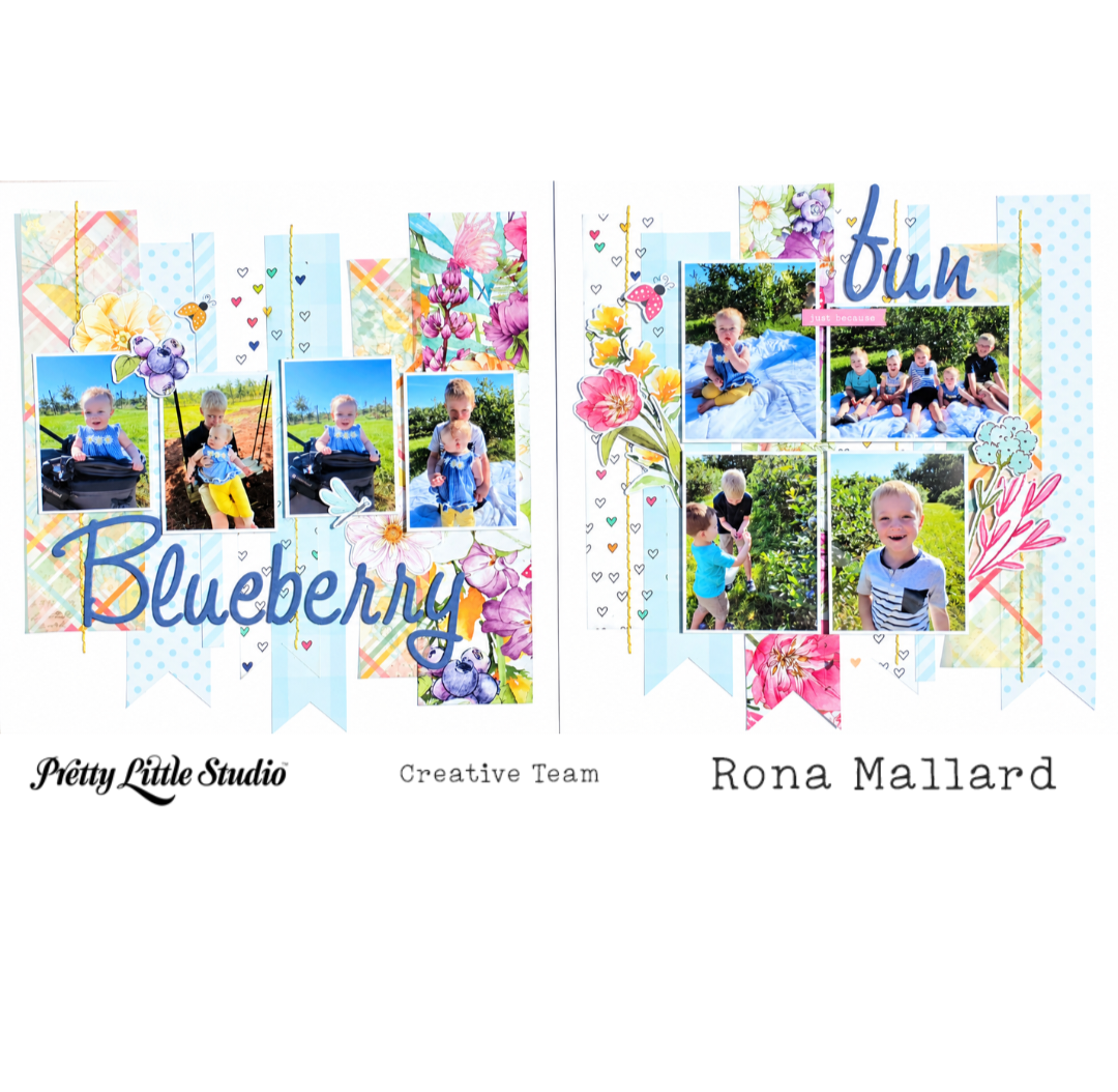
Hi, friends! Today I have a multi-photo 2 page layout using the Sunkissed collection and a few specialty papers from You are my Sunshine! Both of these collections work so well with just about anything I want to document! Today I am documenting all of my grandkids when we went to a local blueberry patch! This layout will go in my youngest granddaughter's scrapbook, but includes all of the kids. For my layout I started with Backyard Beauty , Floral Notes from the vellum pack , Summer Love from the 6x9 clear pack , and a double-sided paper from an older collection Miss Sadie Rose. I cut strips of each of the papers (front and back of the Miss Sadie Rose paper and the branding strip). I punch fish tail banners in several of the strips. Next, I arranged the strips across two sheets of white cardstock. Once I determined where I liked everything I poked holes and stitched 5 lines over some of the strips. (especially the vellum and clear transparency ones because then you don't have to worry about adhesive showing). After stitching I added some diecuts from Smell the Flowers . I also added one phrase diecut from the Ducks in a Row pack. My title was created from circa 2007 raw chipboard alphas that I inked up! I am so excited to have scrapbooked 8 photos of this fun outting!
Capturing the essence of Summer with the Sun-kissed Collection
All the Fall Feels
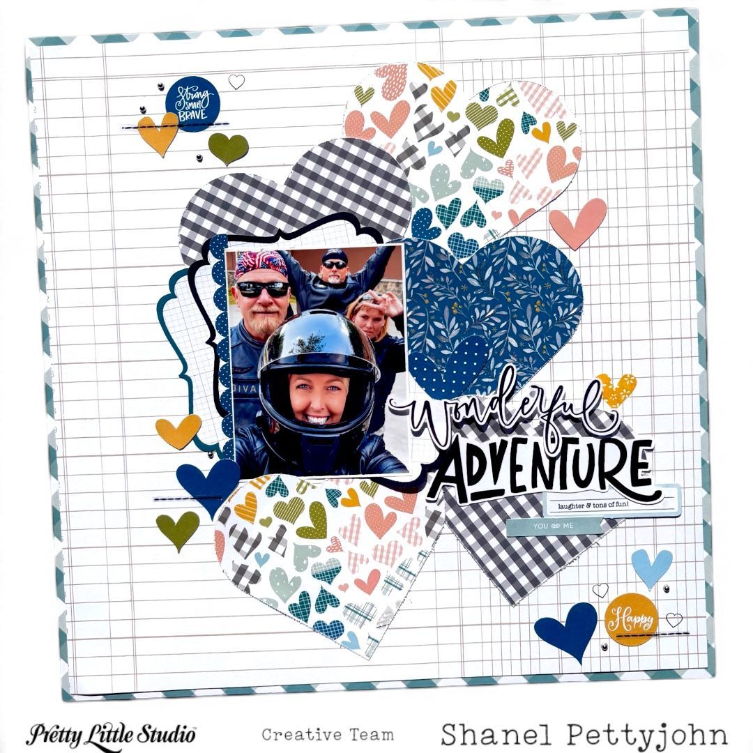
Wonderful Adventure | Pretty Little Studio Design Team Hello crafty friends! I’m excited to share a new layout featuring lots of hearts, layers, bold patterns, and a fun adventure photo. I wanted this page to feel playful and energetic while still keeping the photograph as the main focus. The Frosty Collection has beautiful colors and patterns and can be used for more than just Winter memories. Here I am documenting a Summer adventure with this beautiful collection! I chose several coordinating patterned papers from the Frosty Collection and cut hearts in different sizes. I love how mixing the florals, gingham and colorful heart patterns adds so much interest while still creating a cohesive design. I arranged the hearts in a loose cluster through the center of my page, overlapping some of them and allowing others to peek out from behind the photo. The larger shapes create a great foundation for the layout and help draw your eye directly toward the photograph. I especially love the contrast created by the blue and black-and-white patterns against the white background. For my photo, I added several layers behind it using the Oh What Fun labels . I love adding layers around my photos because they provide separation from a busy background while bringing even more color and texture into the design. The “Wonderful Adventure” title from the Frosty Winter Wishes Titles pack became another major focal point. I placed it beside and slightly overlapping the photo and heart cluster so everything feels connected rather than floating separately on the page. The combination of the script word Wonderful with the bold Adventure lettering adds a fun mix of styles and fits the personality of the photo perfectly! Using the Frosty Sugar Cookies Die Cuts and Frosty Cozy Sweater Word Flags I created little clusters as well. Those little details add just enough interest without competing with all of the patterned papers. I love how this layout turned out! The oversized hearts gave me an easy way to showcase several beautiful patterns on one page, while the dark blue and black-and-white papers provide enough contrast to keep all those colors from becoming overwhelming. Most importantly, the playful design captures the laughter, fun and adventure of the memory in the photo - one of our motorcycle trips with friends to beautiful Eureka Springs. Thanks so much for stopping by today. I hope this layout inspires you to pull out your favorite Pretty Little Studio patterned papers and create something pretty! Join one of the September Challenges in the Pretty Little Studio Fans Facebook group. We love seeing what you create!
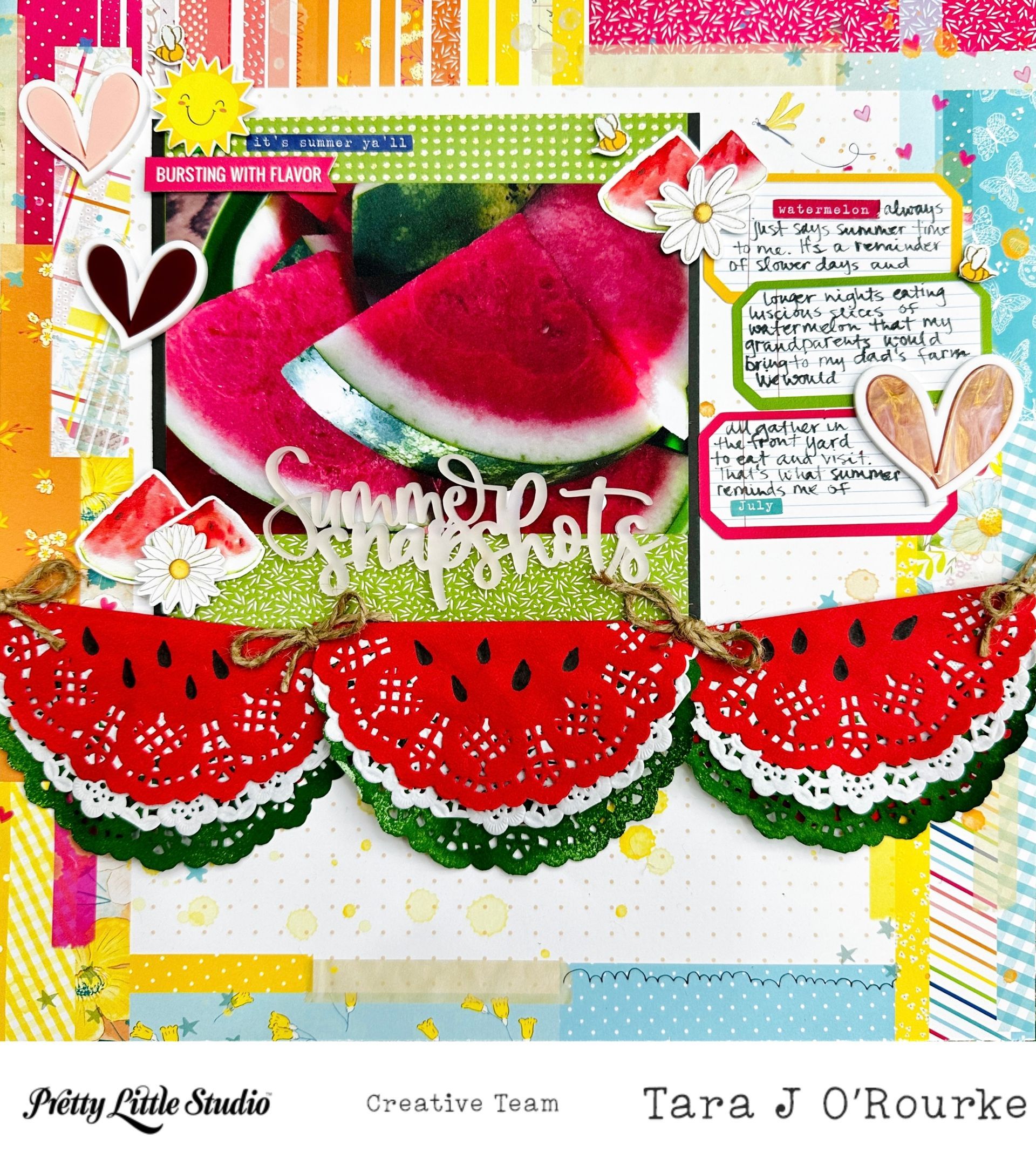
Hello scrappy friends! Tara here today to share a layout using You Are My Sunshine! This month one of the challenges in Pretty Little Studio Fans group on Facebook is "Summer Is A Feeling". For me, a nice bowl of freshly cut watermelon sums up summer in a single photo! I am scrapbooking a photo of sliced watermelon! I started out with a background paper from the Sunshine Mixed patterned paper. I matted my photo on one of the 6x6 patterned papers from Sunshine ACCENT patterned paper pack. I then, matted the entire 6x6 paper with plain black cardstock. I added my title directly to the phone and grabbed three journaling labels to tell my story from the Lazy Days Labels . I used some daisies, bees, a sun, and watermelon slices from the Fruit Salad Die Cuts pack to create a few embellishment clusters around my photo! I also pulled watermelon slices from a few other die cut packs . I grabbed a couple of phrases from the Chasing Summer phrase set , as well as a banner with the phrase "Bursting With Flavor from the Chill Out Words Cut Apart pack to add a little visual interest around my photo.
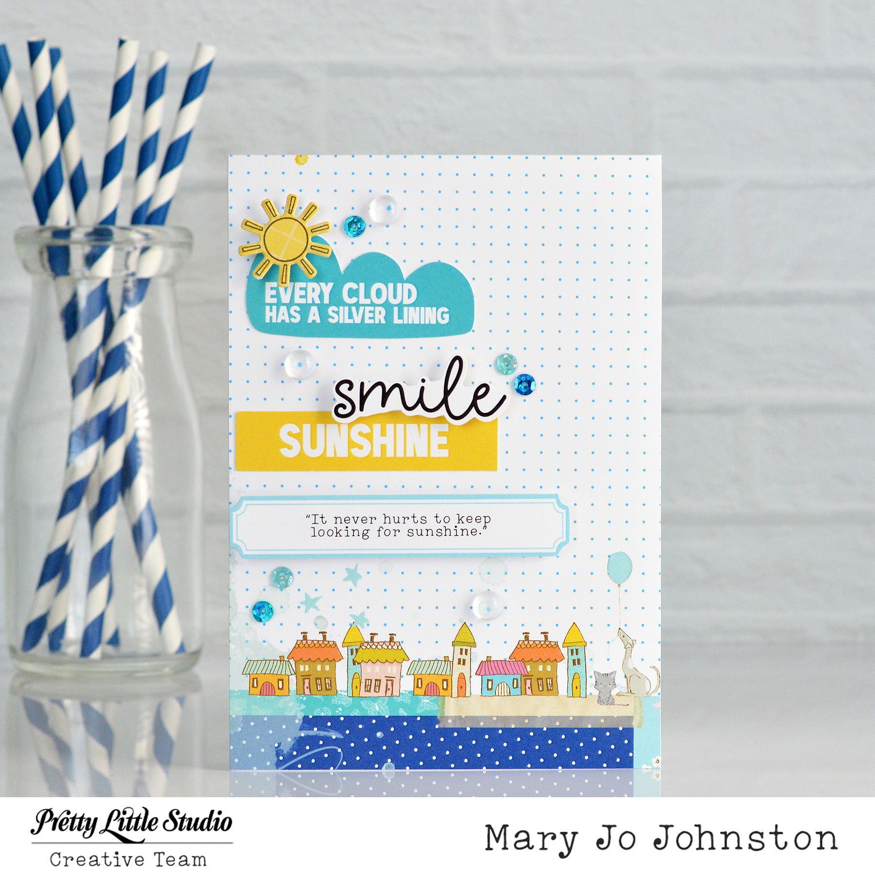
There are some collections that just make you happy the moment you start creating, and Pretty Little Studio’s You Are My Sunshine collection is definitely one of those for me! The cheerful combination of sunny yellow, shades of blue, playful patterns, and sweet little details makes it perfect for creating a card designed to brighten someone's day. For this card, I wanted to let the sentiments and colors do the talking. Rather than creating one large focal point, I built the design with several layers of words, patterns, and tiny embellishments that all work together to tell one happy little story. One of my favorite things about this card is the way the sentiments are layered. The handwritten “smile” sits right above the bold yellow “SUNSHINE” strip. The different fonts and sizes create contrast and make the sentiments feel like part of the design rather than simply words added to the card. The sweet little scene at the bottom is one of my most favorite patterned papers from the collection. It has so many possibilities. Line it up perfectly on your card front, fussy cut the little houses to create whimsical die cuts or add embellishments to enhance the scene. Whatever you choose, this paper will become one of your favorites, too! The Pretty Little Studio You Are My Sunshine collection makes it easy to create cards that feel happy and uplifting. The collection is filled with versatile colors and patterns that can be mixed and matched for summer cards, birthdays, friendship cards, encouragement, or simply a little happy mail. And sometimes, that's exactly what someone needs, a handmade card arriving in the mailbox with a simple reminder to smile and keep looking for sunshine. 💛
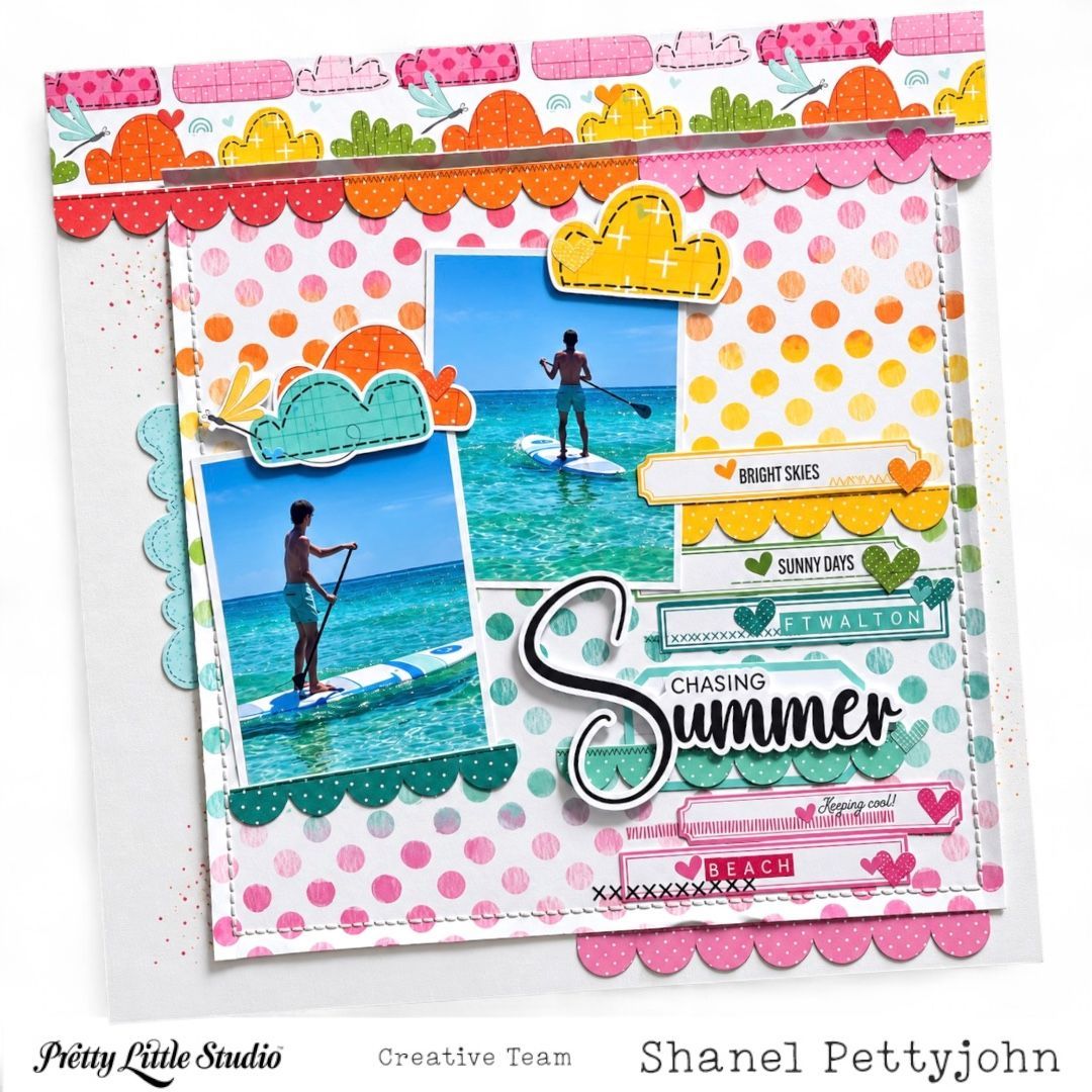
Hello crafty friends! I’m excited to be back today sharing a bright and cheerful summer layout filled with some of my favorite things—bold color, lots of layers, stitching, and plenty of little details! For this page, I wanted to capture the carefree feeling of a beautiful summer day on the water while letting the gorgeous colors and patterns really shine. I created with the Pretty Little Studio SunKissed Collection - perfect for documenting all the summer moments! My photos feature a day of paddleboarding in the beautiful turquoise water, so I knew right away that I wanted the page to feel sunny, playful, and full of movement. I pulled together a palette of pink, orange, yellow, aqua, teal, and green, which worked perfectly with the colors in my photos and gave me that fun tropical summer feeling I was looking for. The polka dot pattern was the perfect foundation. I love the soft watercolor-style dots because they add plenty of color without overwhelming the photos. I also added hand stitching around the edges of this panel. Stitching is one of my favorite ways to add texture to a layout, and here it gives the center of the page a little extra definition while creating a handmade, finished look. I also used (on the labels) the Sunny Stitches stickers to create the look of stitching. Across the top of the layout, I layered a strip of patterned paper and added a row of fussy cut scalloped borders underneath. I repeated those scallops throughout the page—in aqua beside the photos, teal beneath the photo area and title, and pink along the bottom. Repeating the same shape in different colors is such an easy way to create continuity and help all of the different areas of a layout feel connected. Next came the embellishing—always one of my favorite parts! I tucked SunKissed In The Clouds die cuts around the photos and added small heart stickers (also in this collection) throughout the page. I also layered several Sunkissed Sunbeam Label Diecuts along the right side of the photos with phrases stamped that remind me of summer. These little pieces were perfect for reinforcing the summer theme while also creating a visual path that leads your eye down toward the title. My title, “ Chasing Summer, ” became a major focal point of the layout. I love the contrast of the large black-and-white script word “Summer” against all of the bright colors surrounding it. The smaller “Chasing” above it completes the phrase without competing with that beautiful oversized word. I layered additional aqua scallops and embellishments around the title to help it feel like part of the overall design rather than something simply placed on top. From the stitched border and colorful scallops to the tiny hearts, labels, clouds, and dimensional pieces, there is a lot happening—but the white background and repeated colors keep everything feeling cohesive. I also love how the design reflects the photos themselves. The page feels bright, energetic, sunny, and just a little whimsical—exactly how I remember this day. That is always one of my favorite parts of scrapbooking: using color, pattern, and embellishments not only to decorate our photos, but also to help tell the feeling of the story. Summer memories are some of my absolute favorites to document, and this layout definitely makes me want to hold onto those bright skies, sunny days, and beautiful blue water just a little bit longer. Thanks so much for stopping by today! I hope this layout inspires you to pull out your favorite Pretty Little Studio papers and embellishments, mix lots of happy colors and patterns, and have fun adding repeated shapes and layers to your next project.
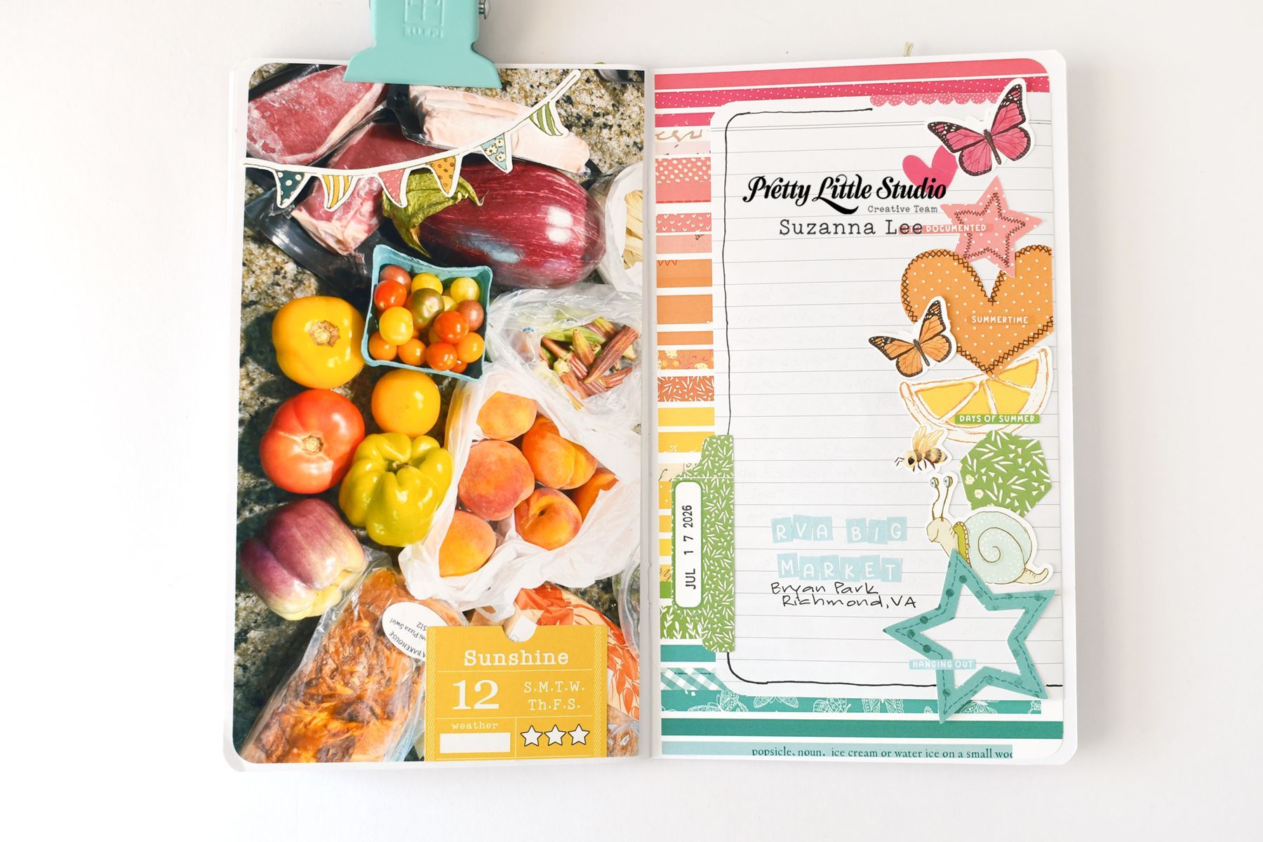
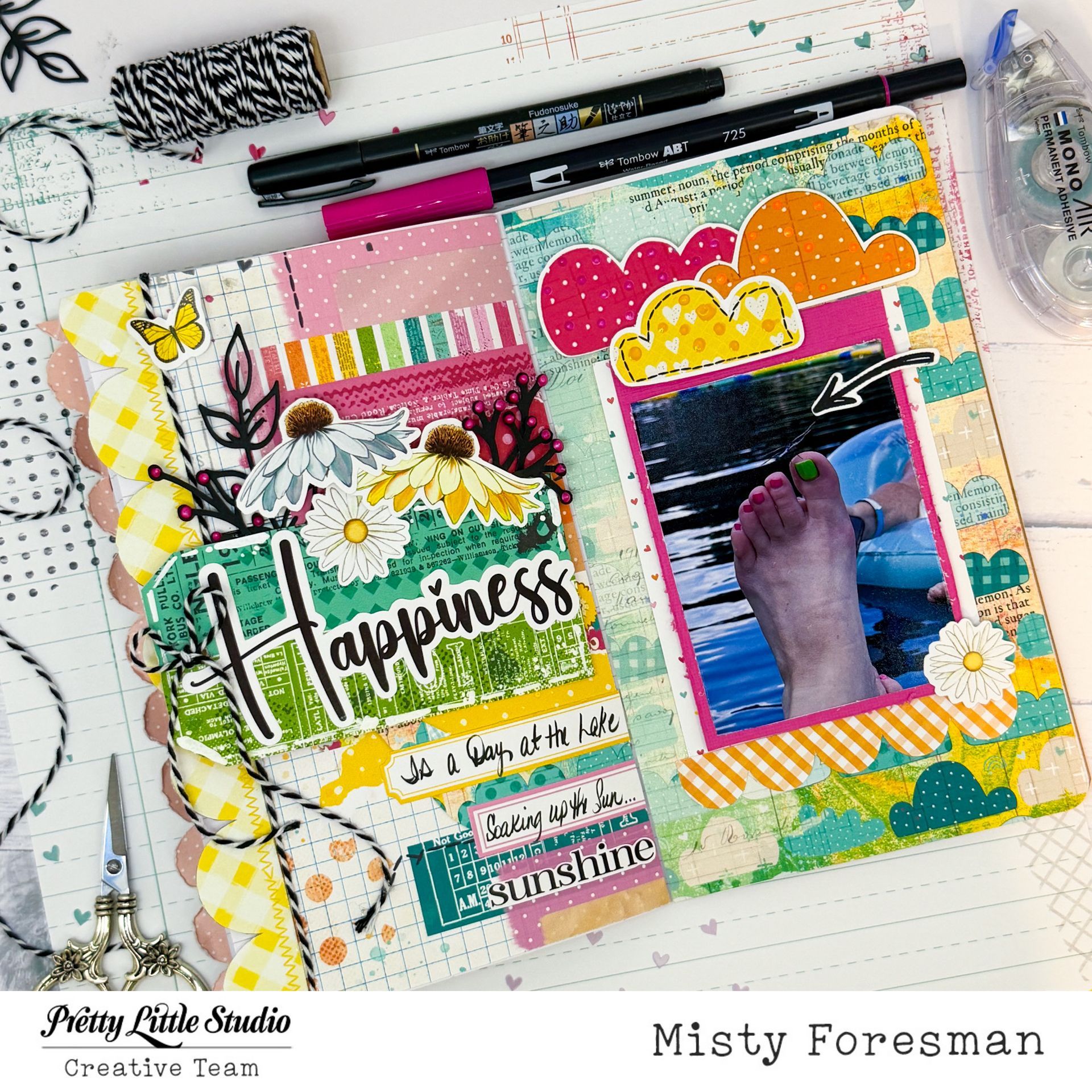
Hello Pretty Little Studio Fans! Suzanna here today to share with you a spread in my Random, About Me travelers notebook that I created with the You Are My Sunshine collection! While we don't go regularly, I love our trips to one of the local farmers markets we have around here. I love how all the color from this collection reflects the bountiful colors of our haul! Here's the full layout;
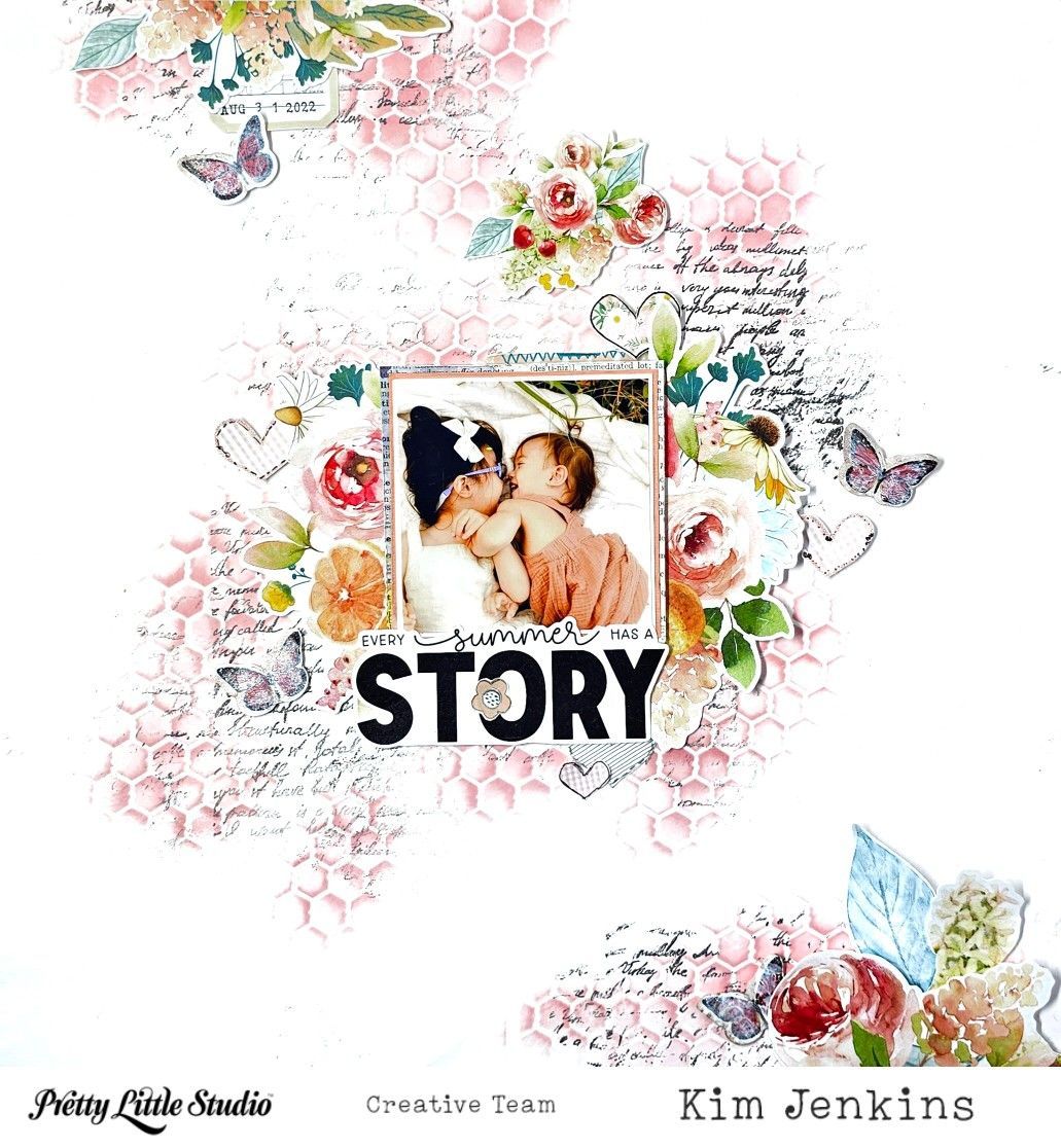
Hi Pretty Little Studio friends, it's Kim and I'm back today with a layout using a mix of collections. I mainly used the Love Is Kind and You Are My Sunshine collections on this page of my sweet granddaughters.
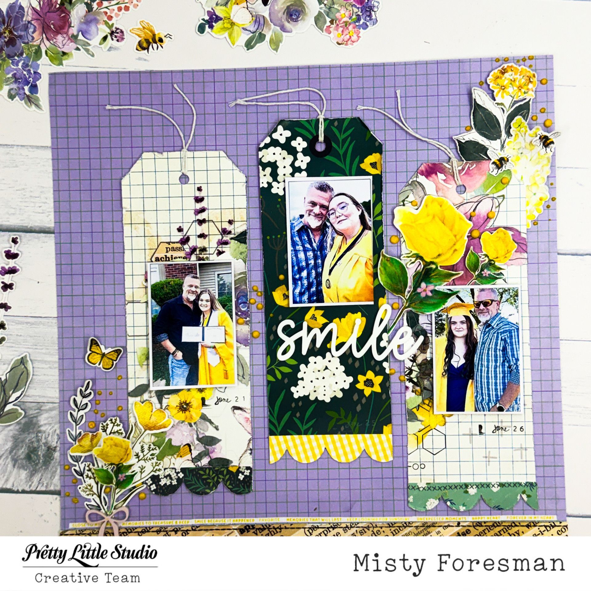
Wildflowers Collection
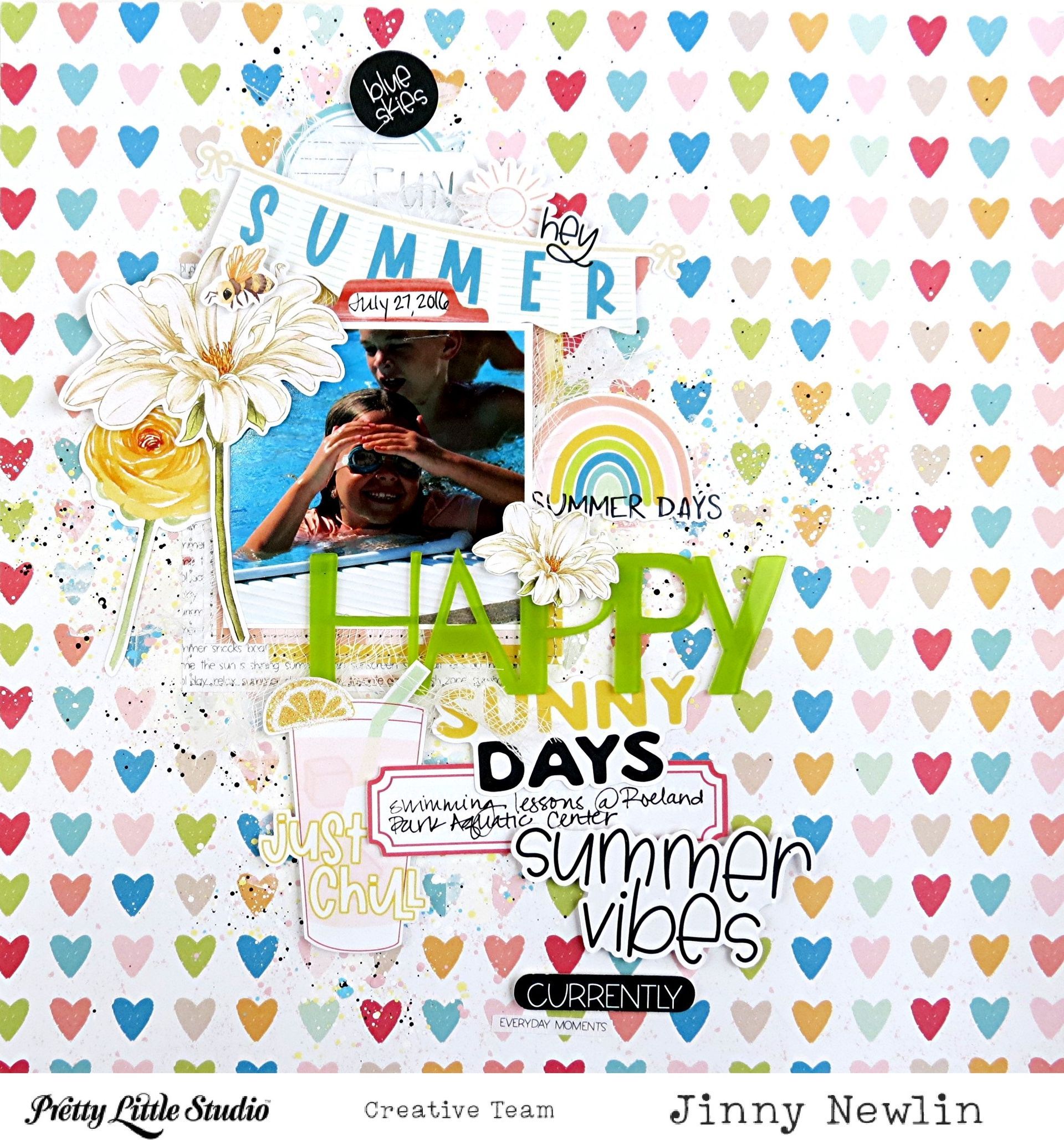
Hey, y'all! It's Jinny here today with a page inspired by our September Scraplift Challenge (Scroll down to see the goods.) and some oldies, but goodies, from the Hey Summer Collection . Weatherwise, it hasn't taken a turn for fall yet in my neck of the woods; so, I'm still holding onto summer.
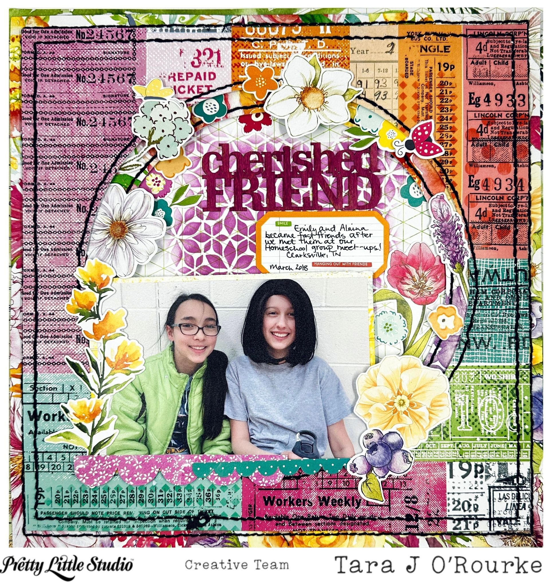
Hello my Pretty Little Studio friends! Today, I am scrapping a cute little photo of my daughter with a new friend she made during a homeschool group meet up. I am using the Sunkissed collection for this layout!! I love the purples in this one and tried to bring those out with my stenciling and inking up of the title. The first thing that I did was to use my Cameo to cut circles out of the center of two patterned papers. One circle is 7.5" and the other is 8.5" (this paper came out of the linked paper pack). The actual circles I stuck back in with my collection to be used at a later date since I am using the negative of the cutfile. Once those were cut out, I did some hand stitching in black floss to help make those papers pop a little and to offer just a tad more texture to my finished layout. I also used an ink pad to do some stenciling in the middle of my background paper . Once the stitching was completed, I added some fun foam to the back of each paper so that I would have some depth to my background. Here's a photo of the background drying out on my mat before finishing up the layout.
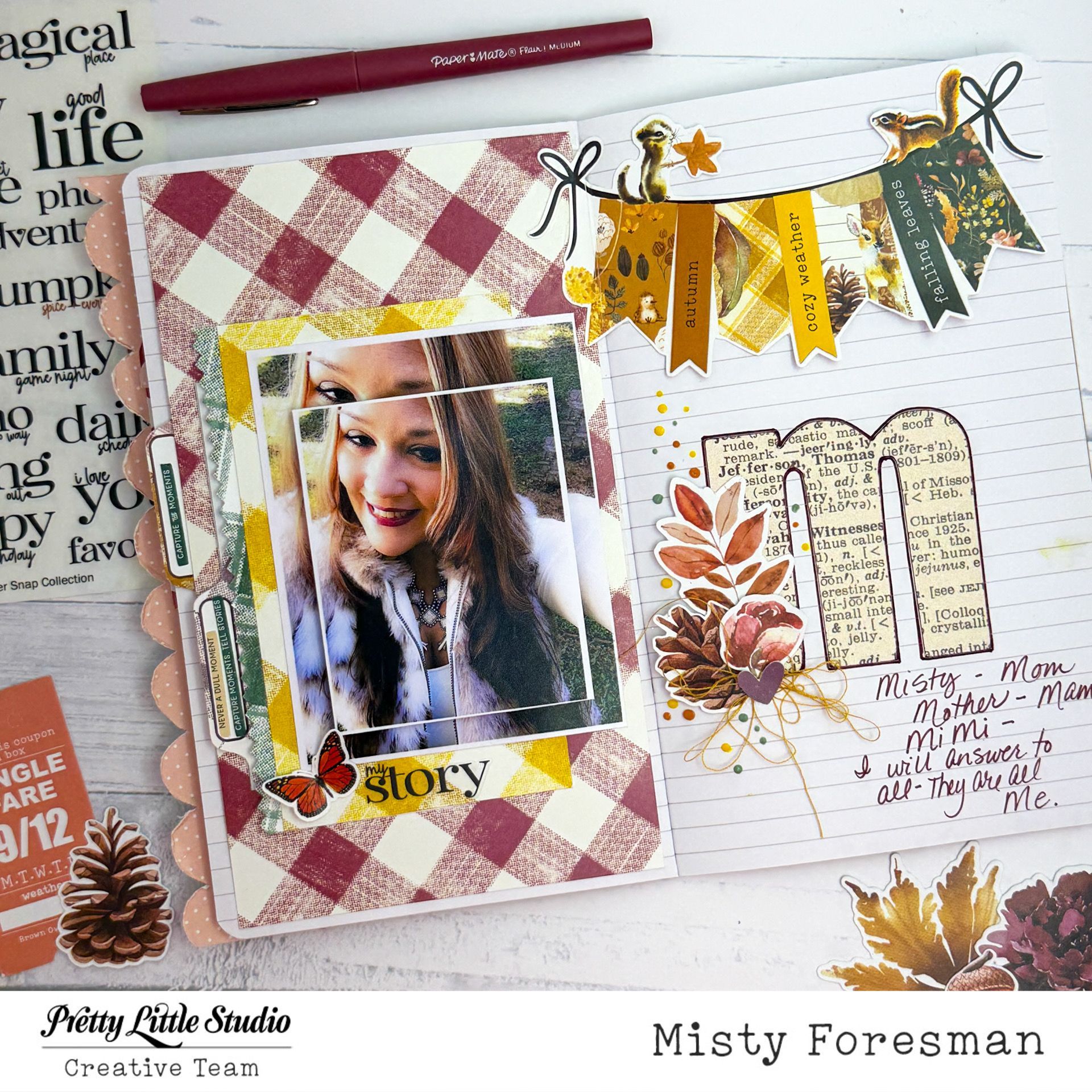
Traveler's Notebook with Digitals and Ginger Snap
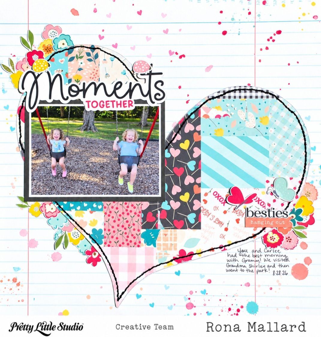
Hi, friends! Today I have a layout using the Love is Kind collection! I love the softness of this collection along with all the sweet sentiments! I think this collection has been so versitile for so many occasions! Today's layout is a sweet moment captured of my two granddaughters. They are cousins who are sometimes more like sisters! I hope they continue to share this sweet bond (and maybe get over the drama lol)! For my layout I started with the gorgeous Heart You paper. It has the most perfect faux stitching all around the heart! (So, of course, I decided to use those lines to poke holes and stitch over it LOL!) After I did all my chain stitching around the heart I cut the heart out being careful to preserve the background because I just wanted to be able to tuck some little flowers under the edge of the heart. Which I did in three places using the Forget Me Not punch out diecuts . I also added a few diecuts from the Lovely Mix . My title is from the Story of Us words . I did pop up my photo and title, as well as, the edges of several of my little florals and butterflies with foam tape for some extra dimension. I kept it very simple and I think it worked out perfect for this photo!
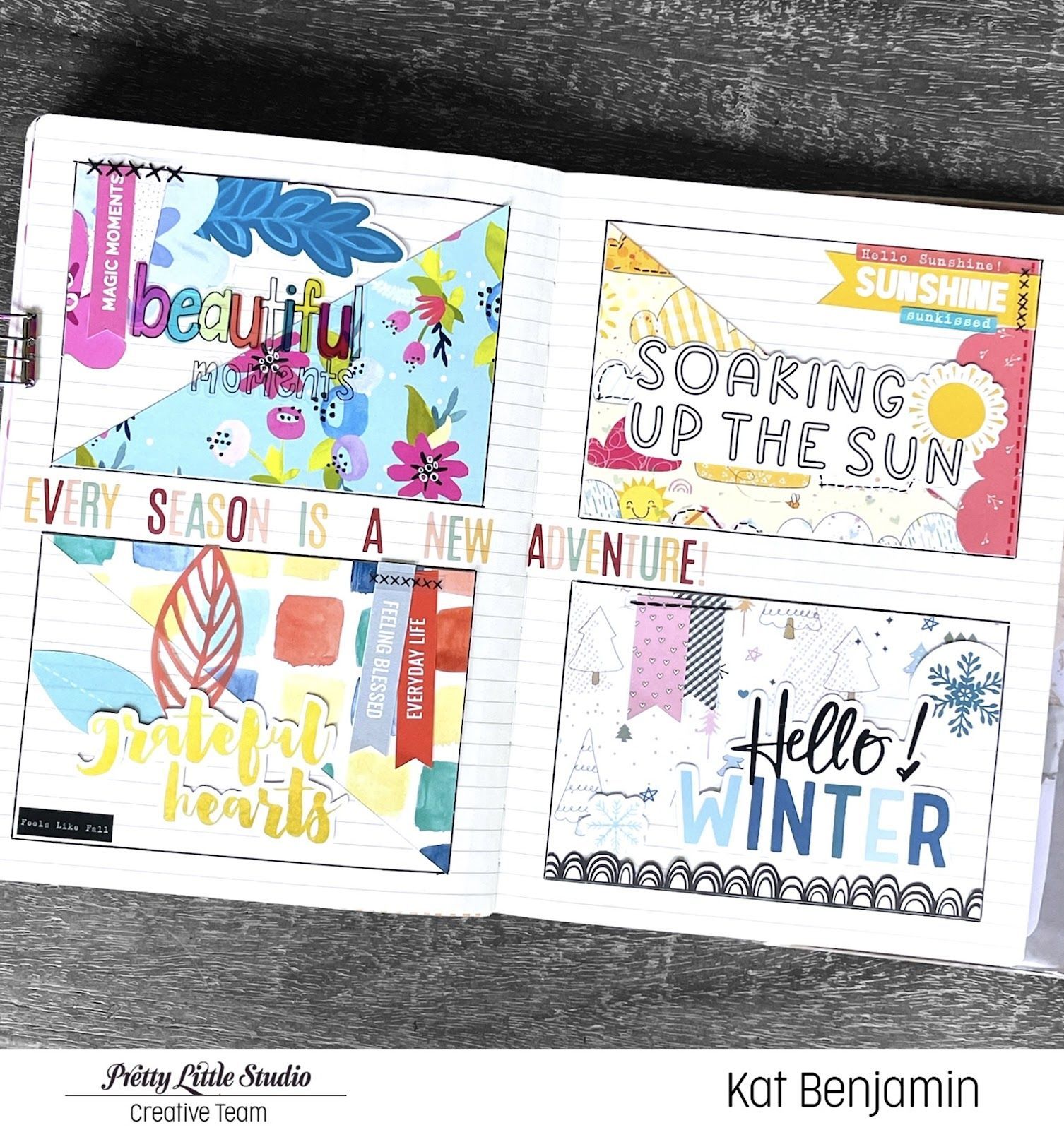
Hi everyone! Kat here to share a new project with you. I recently joined a Sisterhood of the Traveling Journal group. In this group, everyone creates a journal filled with fun prompts and then mails their journal to someone else in the group. The chain continues until everyone has played in everyone else's journal. It's such a fun concept. Another popular thing to do in these journals is to leave a few blank pages for each person in the group to add something fun to your journal - really whatever strikes their creative fancy. So, for this journal, I decided to create a fun "seasons" page using a bunch of different PLS collections, including Feels Like Fall, Blooming Hearts, You Are My Sunshine, and Frosty and Friends. Here's what I whipped up:
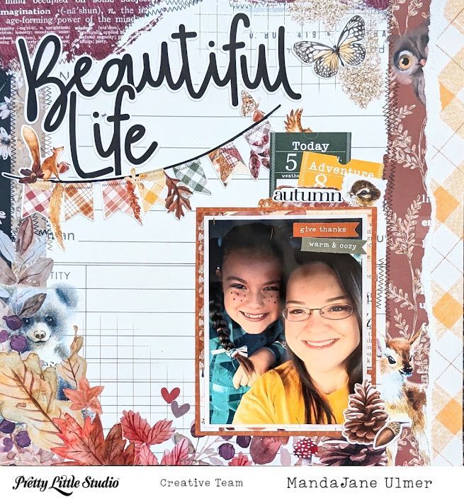
Hey Scrappy Friends! MandaJane with you today. One of my all-time favorite collections from Pretty Little Studio is the fall themed Ginger Snap collection. It has been my favorite for literally YEARS! Now that PLS is releasing an all new autumn themed collection called Heartwarming, I've decided to stop hoarding my Ginger Snap supplies and actually get them into my albumns! This photo is one of my favorites from carline when I used to take my kids to school in the morning. This particular day was the last day of school before Thanksgiving break. My daughter, Elizabeth, was having a Hoedown Throwdown where she had to dress up as a cowgirl. I really miss the days when the kids used to have to dress up at the Primary School. Oh, what fun times they had!
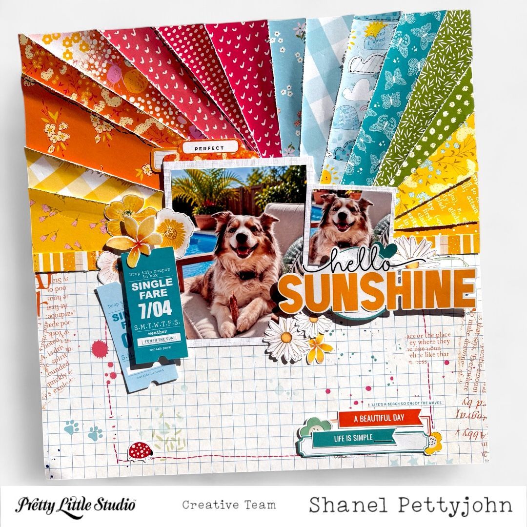
Hello, Shanel here today sharing a new Pretty Little Studio Design Team layout featuring our challenge for this month - Summer is a Feeling. I’m excited to share a bright and cheerful summer layout created with the Pretty Little Studio You Are My Sunshine collection. This collection is filled with the happiest colors and patterns, and it was perfect for documenting one of those simple summer moments that makes me smile—my sweet dog relaxing in a lounge chair by the pool. For this layout, I wanted to capture more than just a day by the pool. I wanted the page to reflect that carefree, colorful feeling of summer, so I built my design around a large layered sunburst filled with patterned papers. Creating the Layered Sunburst I started with a patterned paper background, the Fly A Kite patterned paper from this Collection, and created a large sunburst as the main foundation of my page. I cut rays in different widths and lengths from several patterned papers in the You Are My Sunshine collection, choosing a playful mixture of yellows, oranges, reds, blues and greens. Instead of making every ray perfectly uniform, I varied the patterns and sizes to give the sunburst a more relaxed, handmade appearance. I layered the rays slightly over one another, which added dimension and helped all those gorgeous patterns work together without feeling too structured. The sunburst immediately brought so much movement to the page and naturally draws your eye toward the photo. I placed my photos of my pampered pooch where they could become part of the sunburst rather than covering too much of it. By adding card stock behind the photos, it gives separation from the busy background and help them remain the focal point. Next came the florals - I clustered floral die cuts from the You Are My Sunshine Collection Fruit Salad diecuts around the photo mixing different sizes and I used dimensional adhesive behind several of the flowers so they lift slightly from the page. I love the contrast between the geometric lines of the sunburst and the softer shapes of the flowers. These little connections help all of the different areas of the page feel like one cohesive design! Sticker phrases are scattered around the page from The Chasing Summer package and labels from Poolside Labels help the design feel more connected at the bottom of the page, both from this beautiful collection. The idea behind this page really became my title and theme using a Hello Sunshine title from the You Are My Sunshine Peachy Titles. Sometimes the photos we scrapbook aren't about a big vacation or special event. They're about those everyday moments that capture exactly what a season feels like. A sunny afternoon, the pool, a favorite lounge chair—and my sweet furry friend who clearly understands how summer is supposed to be enjoyed! The colorful sunburst, playful patterns, florals and die cuts from the Pretty Little Studio You Are My Sunshine collection were the perfect way to capture that happy, relaxed summer vibe! I hope this layout inspires you to pull out several of your favorite patterned papers and combine them into one bold design. A sunburst is such a fun way to use lots of patterns on a single page. Thanks so much for stopping by today. Happy creating!
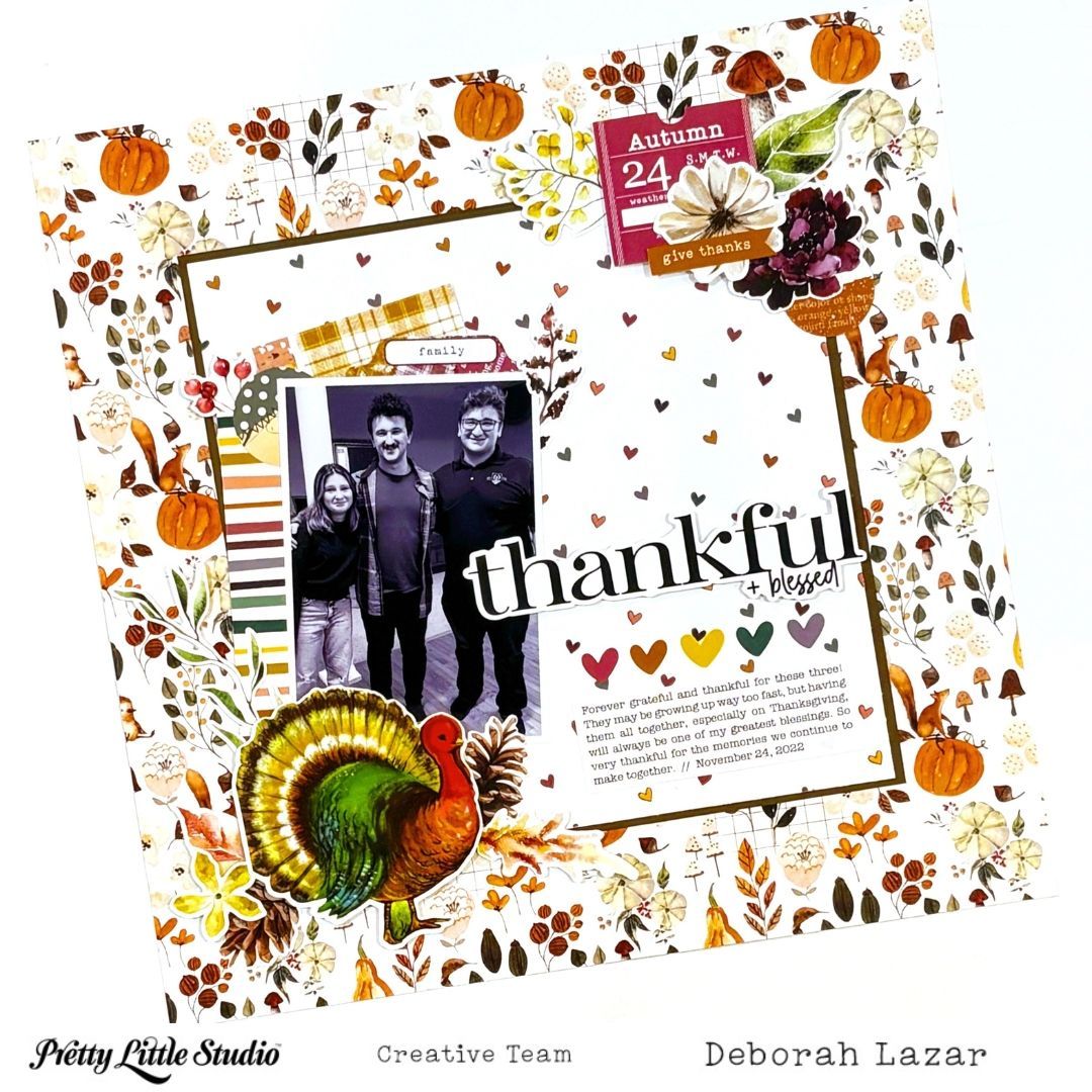
Hello Pretty Little Studio friends! I’m so happy to be back sharing another layout, this time using the beautiful fall colors and patterns from the Ginger Snap collection! My layout is titled Thankful + Blessed , and I love how all of the warm autumn colors and seasonal details came together to document this family photo. I started with the Pumpkin Pie patterned paper from the Ginger Snap collection for my background. The beautiful mix of pumpkins, florals, leaves and other fall elements gave me so much detail to work with before I even began adding anything to the page. I love a patterned paper that does some of the work for you!
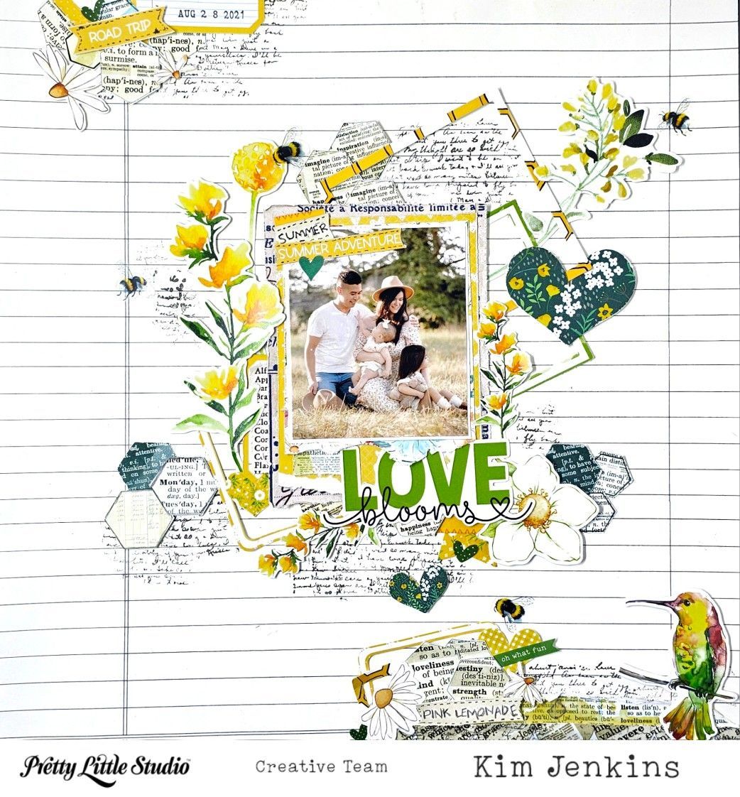
Hi Pretty Little Studio friends, it's Kim and I'm back today with a layout using a mix of the fabulous Love Is Kind and Wildflowers collections. I had this older photo of my daughter and her family and thought it would work great for my take on the September sketch.
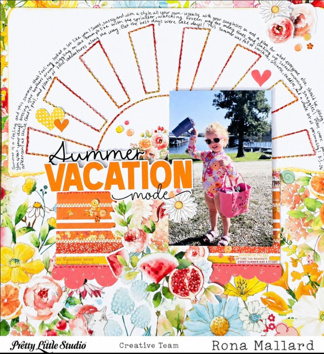
Hi, friends! Today I am sharing my inspiration layout for the new September Challenge called Summer is a Feeling. We are to create a layout that captures what summer felt like, rather than simply documenting what you did! This was such a fun challenge and I can't wait to see what everyone else comes up with! Click that link for the Facebook Group above and play along along with this or one of the other challenges. You could be our lucky winner of the September prize (a $25 store credit)! For my layout I started with the gorgeous Summer Garden paper . It was the perfect backdrop for this photo because it matched the feel of my granddaughter's bathing suit (not that I ever need a reason to use a gorgeous floral lol)! I stitched a cutfile for the top half of my layout inked around the edges of the white paper and used a scrap of the Pick up Sticks paper I had used on an earlier layout to tuck just underneath that to create a little shelf for my photo and title. Under that striped paper I added a die cut border to add that peach pink color, it finished off that area so nicely. The title was from the Just Peachy Word Titles . I added the word Summer (from an older collection) to Vacation Mode to complete the title I was going for. Tucked in under the title is a large floral cluster from the Apple Blossom Floral pack . I then added a sticker from the Apple Blossom Sticker sheet just above the title. I like how it fit nicely and sort of highlighted the rounded area of the sun. I tucked a single daisy on the photo by the title and three single flowers from the die cut pack Fruit Salad (they are popped up on foam tape of different heights). I added my journaling following the arch of the sun rays and then as finishing touches I popped a few sequins and three die cut hearts from the Light Hearted pack .
Love is Kind Collection & September Sketch Challenge
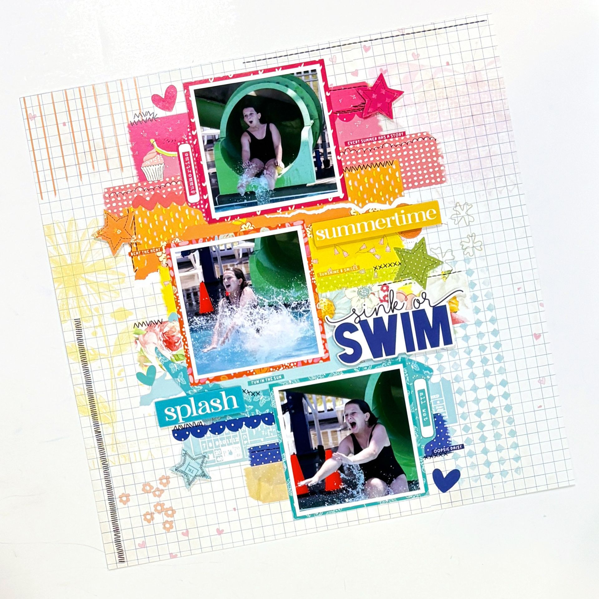
Hello Pretty Little Studio friends! I’m so happy to be back sharing another layout using the bright and cheerful You Are My Sunshine collection! This page features three photos of my daughter, Hailey, coming down the waterslide at camp. I love using a series of photos for moments like this because they capture the action from beginning to end—and judging by Hailey’s expressions, this was definitely an adventure! I started with the Under the Sun patterned paper from the You Are My Sunshine 12x12 Mixed Paper Pack for my background. I absolutely love papers like this because they make it look like I spent tons of time adding different layers, patterns, stitching and mixed media when it’s actually all part of the pre-printed design. It almost feels like cheating because so much of the work is already done for you!
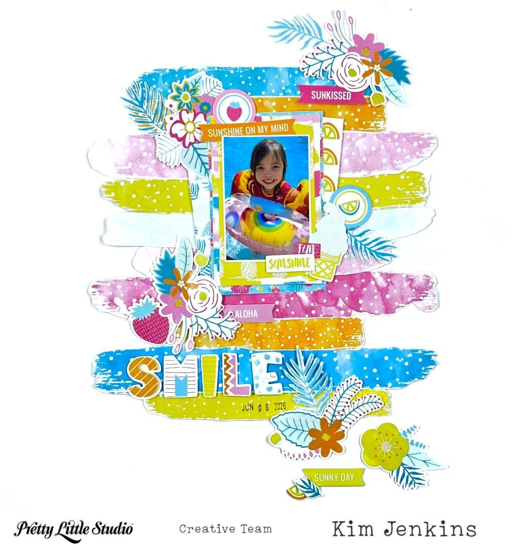
Hi Pretty Little Studio friends it's Kim and I'm back today with a layout using an older collection called Chasing The Sun. It was just the perfect collection to document this photo of my granddaughter. A newer collection with similar colors Sunkissed is still available in the shop.
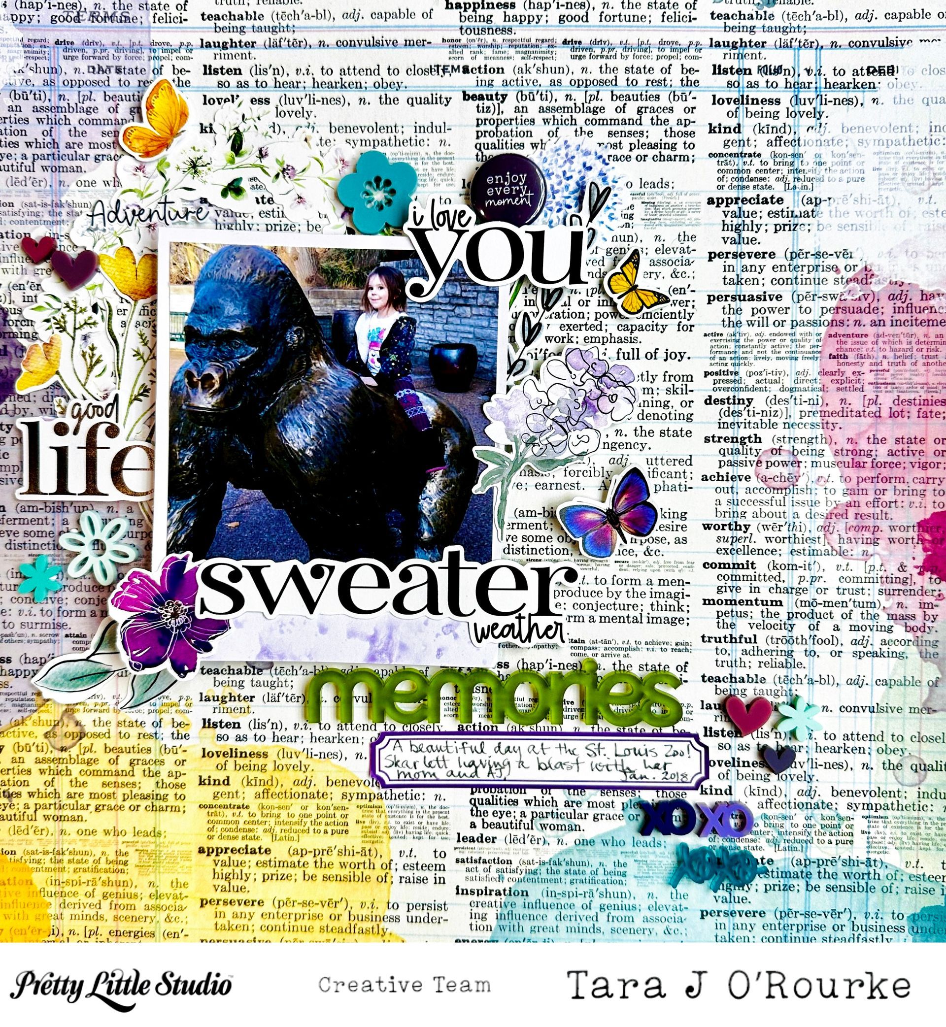
Hello my scrappy friends! Today, I am sharing my layout that I created using the September Scraplift Challenge for the September Scraplift Challenge over on the Pretty Little Studio Fans Facebook Group ! For September, we are scraplifting Evelyne's beautiful layout, which I will share at the bottom of the layout!! I started out with the Fragrance patterned paper for my background! This is such a favorite patterned paper of mine, which is why I had four sheets of it in my stash! It has lots of pre-made mixed media and wonderful definitions on it as text! I grabbed the wreath that I got in a recent Grab Bag purchase on the Pretty Little Studio site and tucked it into the top left corner of my 4x4" photo that matted to look like a polaroid frame. I also pulled some titles from the Ginger Snap collection that I thought went perfectly with my photo of my granddaughter at the St. Louis Zoo, plus the word "Adventure" from the Spring Mix Stickers . I layered those on the photo and around the photo in a similar fashion the Evelyne's original layout. Next, I grabbed a piece of the flair from the Flopsey Flair package. To finish off my layout, I added some die cut flowers from the Wildflower Stems die cut pack . The last thing that I added was a purple label from the Be Jolly labels in Candy Cane! Evelyne's layout was so easy to scraplift! I hope you'll give it a try as well! There are albums in the Facebook group where you can share your own version!
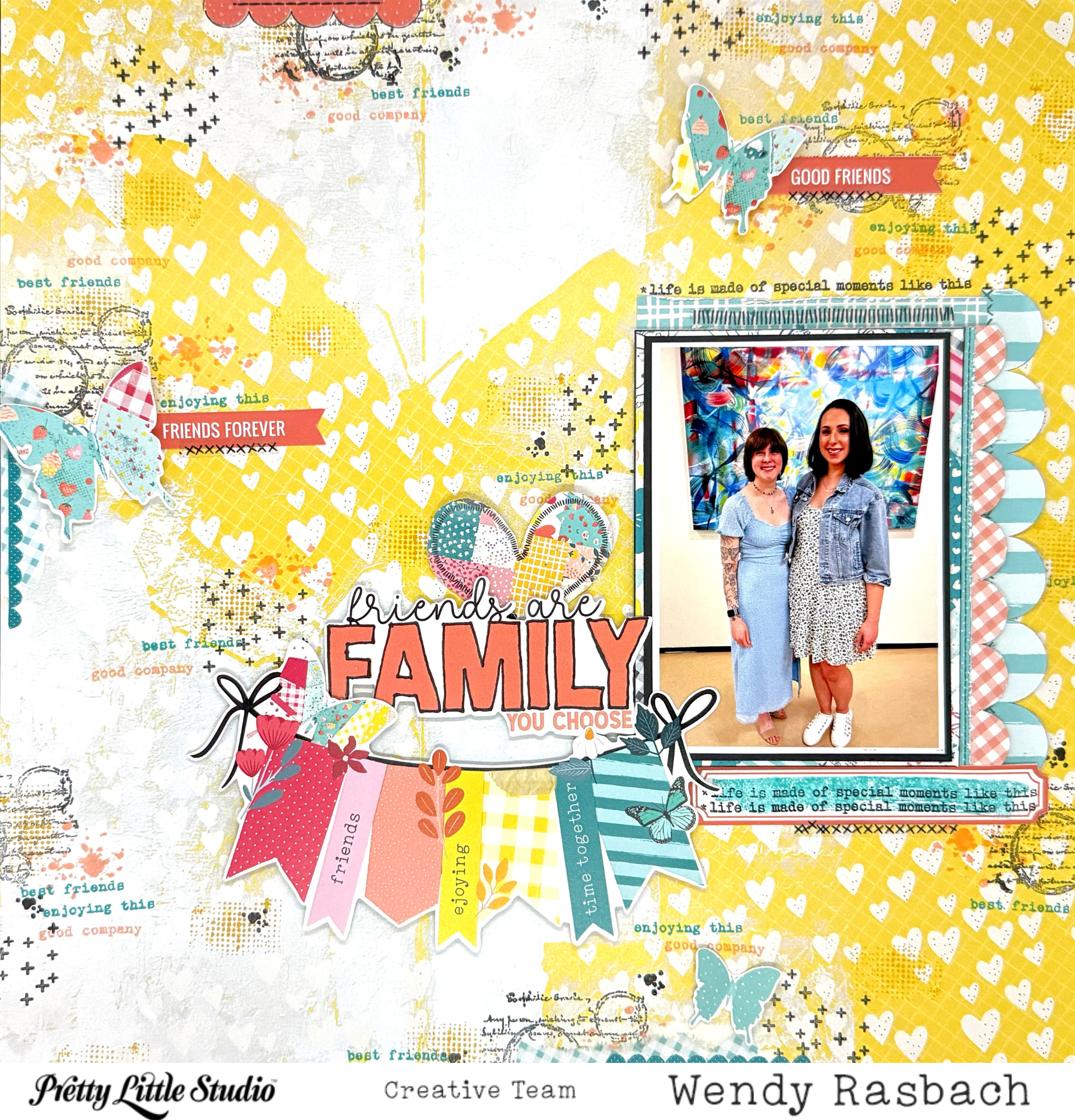
Hello to all of my fellow Pretty Little Studio creators! This month I had so much fun scraplifting Evelyne Schmidtke's recent PLS layout! I used the Love Is Kind collection.
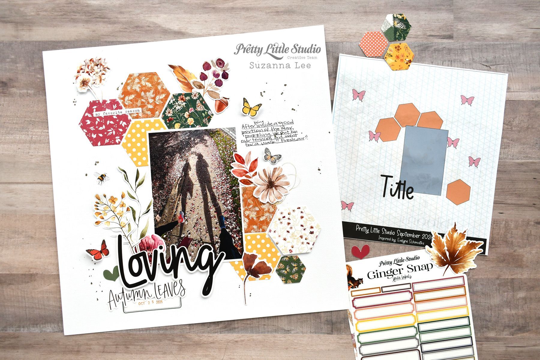
Hello Pretty Little Studio Fans! Suzanna here today to share with you a Fall (or Autumn) sketch inspired layout created using the Ginger Snap collection. Here's the September sketch challenge sketch;
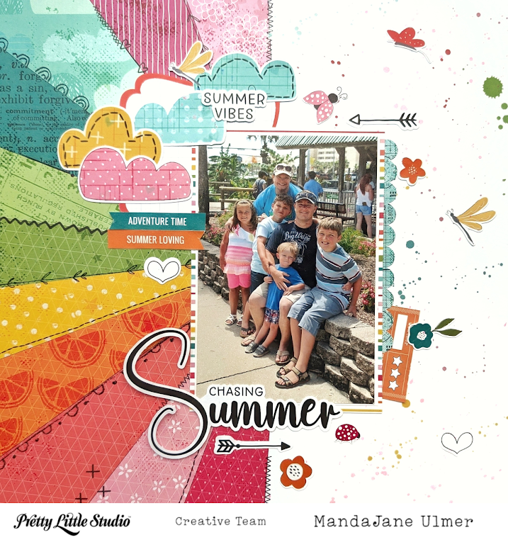
Hey Scrappy Friends! MandaJane with you today. I have a layout for you today, made with the Sunkissed collection. I know that this is technically a spring collection, but it was perfect to document our summer family vacation photo at the Track in Destin , FL. This photo is a throwback to 10-12 years ago when the kids were still small enough to spend a fun afternoon at the theme park. And this rainbow sunburst is such a great background for our photo! You can find this sheet as a singe sheet, or it is included in the Sunkissed Main paper pack.
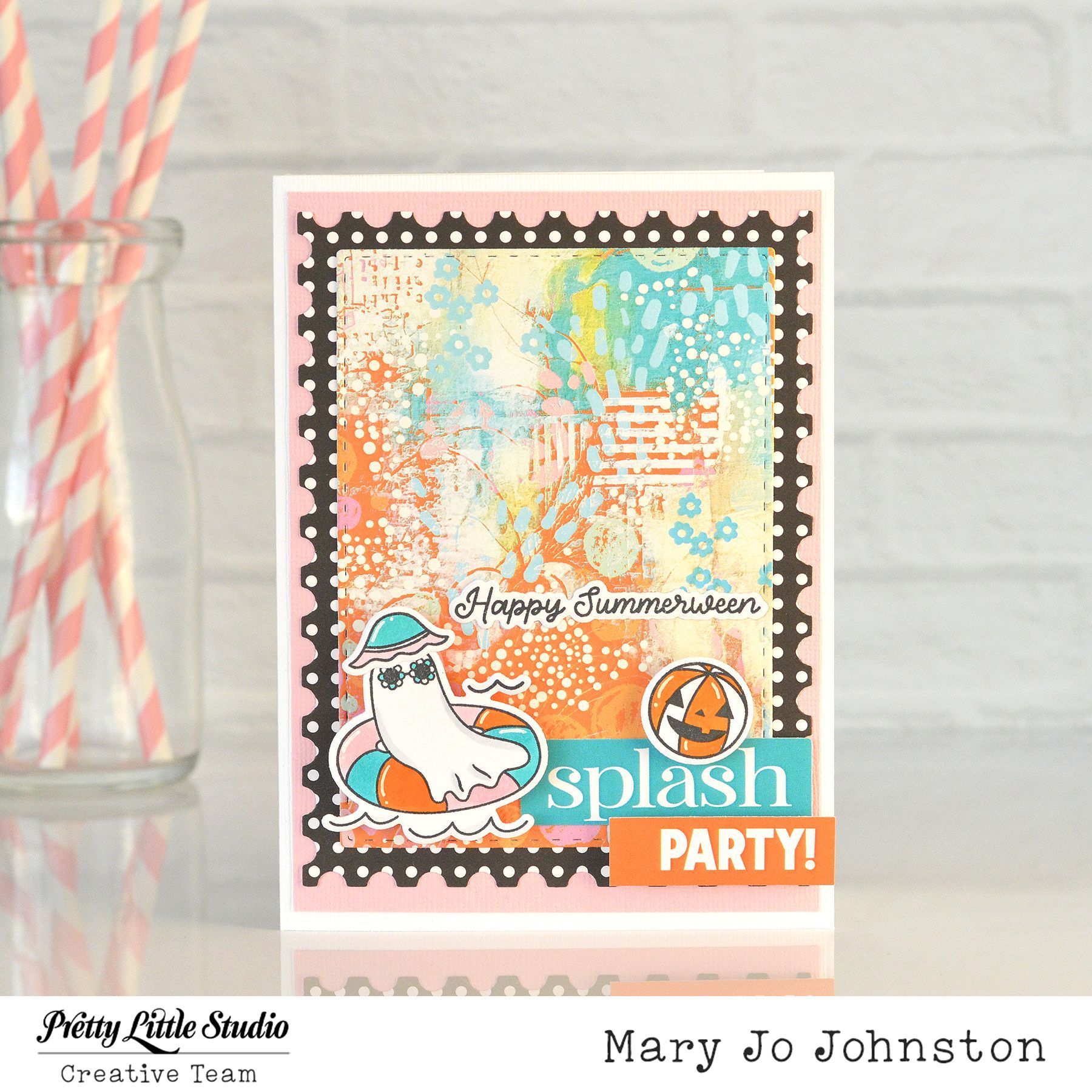
There’s still time to splash into summer, and this card is all about making the most of those last few weeks of sunshine before we welcome fall and Halloween!
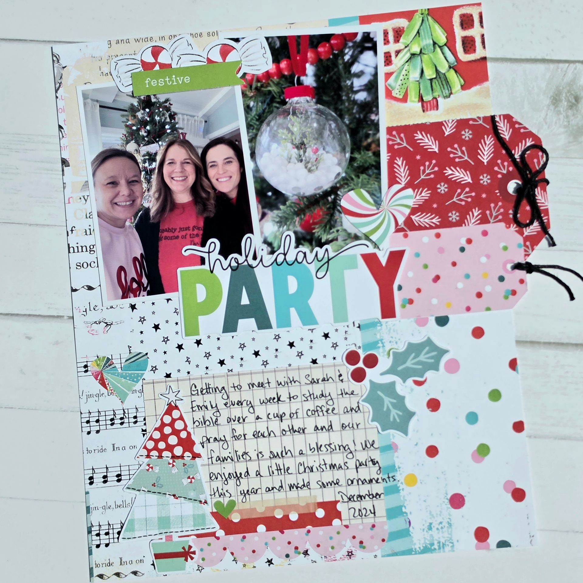
Hi, friends! I have a 6x8 layout to share today that I created for my Christmas album. This is an album I create to display at Christmas every year. I use 6x8 albums and add several years in each. I have 3 volumes so far going back to 2017 but would like to eventually go back to our earlier years too! I used the adorable Candy Cane collection for this one. I started with the Gingerbread House patterned paper that I had already cut into on a previous layout. There was a little tear in it but I was determined to use it. I was able to cover the tear with a tag from the diecut tags and I also layered a little cut apart tag with it. I love when I can have elements hang off the edge of a page in these smaller format books!! I layered my photos and title in line with the tags and popped a cute heart punch out diecut over both the photo and tag. I used a few sweet candy die cuts and a word tag to embellish the top of the photos. At the bottom of the layout I used a journaling card (which are double sided by the way and so cute to use on a flip up or in a pocket card!). I added a couple more diecuts from the same pack that I linked above and a little scalloped border sticker to bring some more pink to the bottom of the layout. I really like how this turned out! Do you like to do Christmas layouts throughout the year or mostly in December and January?
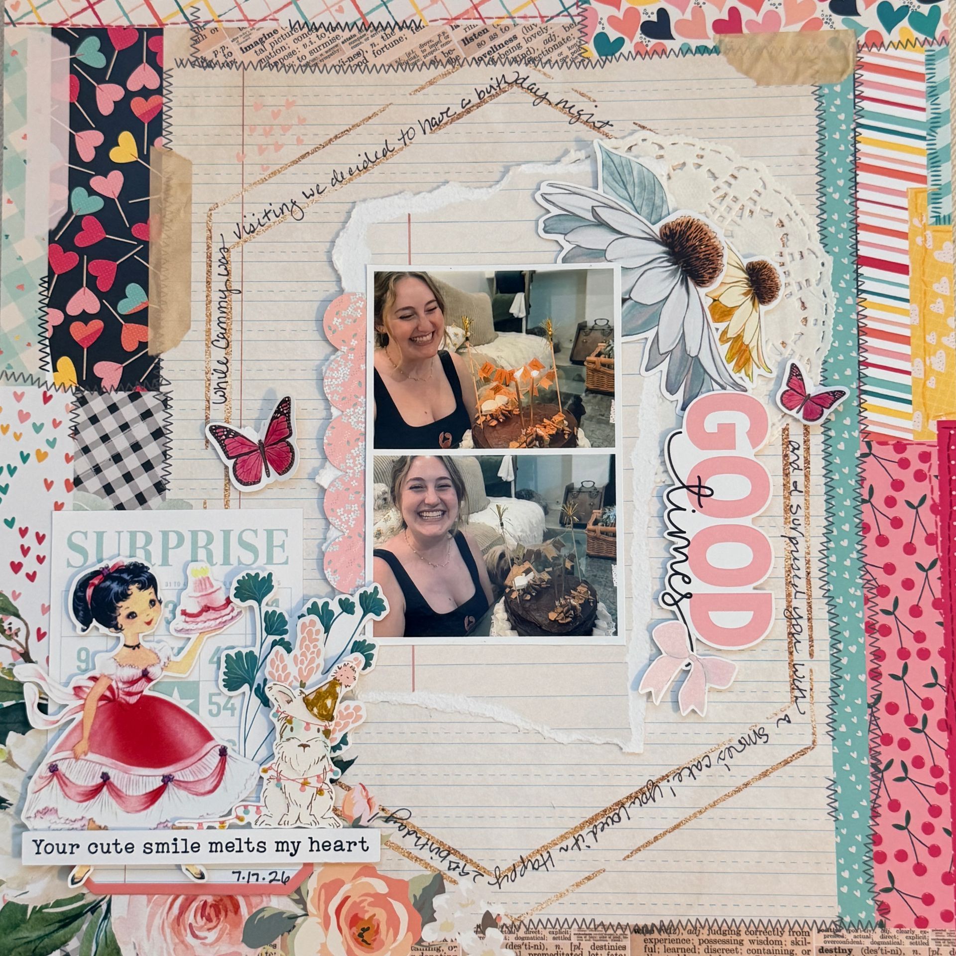
Hi there! Lisa here today to share a layout I created with the collection dear to my heart, Love is Kind, along with some vintage Pretty Little Studio products. Maybe you've been a PLS fan for years like me and have a stash of these sweet vintage die cuts or the fun bingo cards. This bingo card was from an old and now retired birthday collection but if you like the look of bingo cards just search that on the PLS shop and you'll find lots of themes still available! I loved this background paper, "way we were" because of the hexagon in the background. I decided to use it for my journaling and I love the detail it added. The vintage die cut of the girl is from the Happy Birthday die cut pack , isn't she sweet? I think the layout is pretty straightforward, I used a scrap of ledger paper for the background of my photos and just tucked lots of florals and other die cuts into the layout. I added a doily from my stash as well. Thank you for stopping by today! Hope I've inspired you to use your vintage die cuts with a collection from this year!
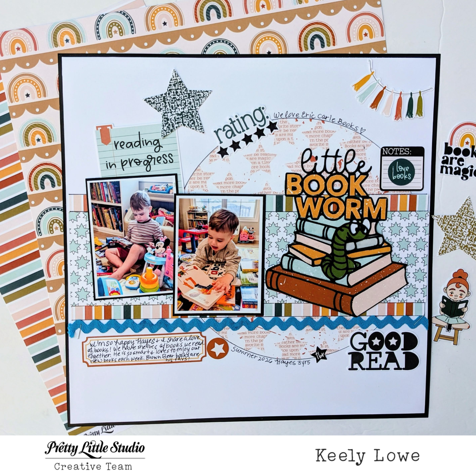
My Little Bookworm
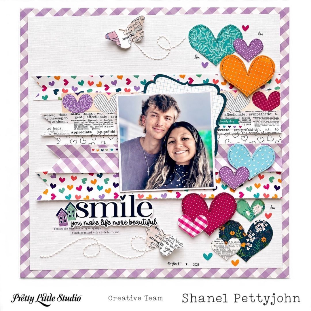
Hello Pretty Little Studio friends! Shanel (@Shanel_craftwithme) here today sharing a new project with one of my favorite Pretty Little Studio collections - Wildflowers. Some photos instantly make me smile, and this sweet photo of my son and his gf was the perfect choice for this layout. I wanted the page to feel happy and playful so I built the design around colorful hearts, soft lavender tones, and layers of patterned paper from the Wildflowers collection. One of our design challenges this month is adding texture to the page. I scored each strip, slightly bending up the edges to add texture and dimension and then arranged them horizontally across the page using a mix of colors and patterns from the collection. The repeated lines create a subtle backdrop while still letting the bold colors and delicate patterns shine! For a playful touch, I added a cascade of hearts along one side of the page, fussy cut from 12x12 Clover and 12x12 Clover Patch patterned papers. The colors and varied patterns of the hearts included on this patterned paper are AMAZING! I mixed patterned paper hearts and sticker hearts from the Wildflowers Spring Mix pack in different sizes and slightly varied their placement to create the feeling that they were falling down the page. I wanted to keep the photo area relatively clean so the layout wouldn't feel too busy. Using white card stock (slightly distressed on the edges) and a Die Cut Bracket from the Wildflowers Gentle Breeze pack to back the photo, it stands out but doesnt compete with the design. Lastly, to create even more texture and guide the eye across the page, I added stitching trails for the beautiful butterflies, die cut from the beautiful Wildflowers Fragrance patterned paper. They add a soft touch and bit of whimsy. The “Smile” title (SunKissed Collection) atop some cute stickers from Wildflowers Spring Mix sticker pack was the perfect finishing touch! It’s the perfect reminder that sometimes the simplest moments—and the people who make us smile—are the memories worth documenting. The combination of scored paper strips, colorful patterns, and cascading hearts gives this page lots of texture while keeping the overall design simple, playful and full of color! I hope you enjoy creating today with your favorite Pretty Little Studio collection. I’d love to see what you create. Share your layouts on the Facebook page and join in on the monthly challenges :)
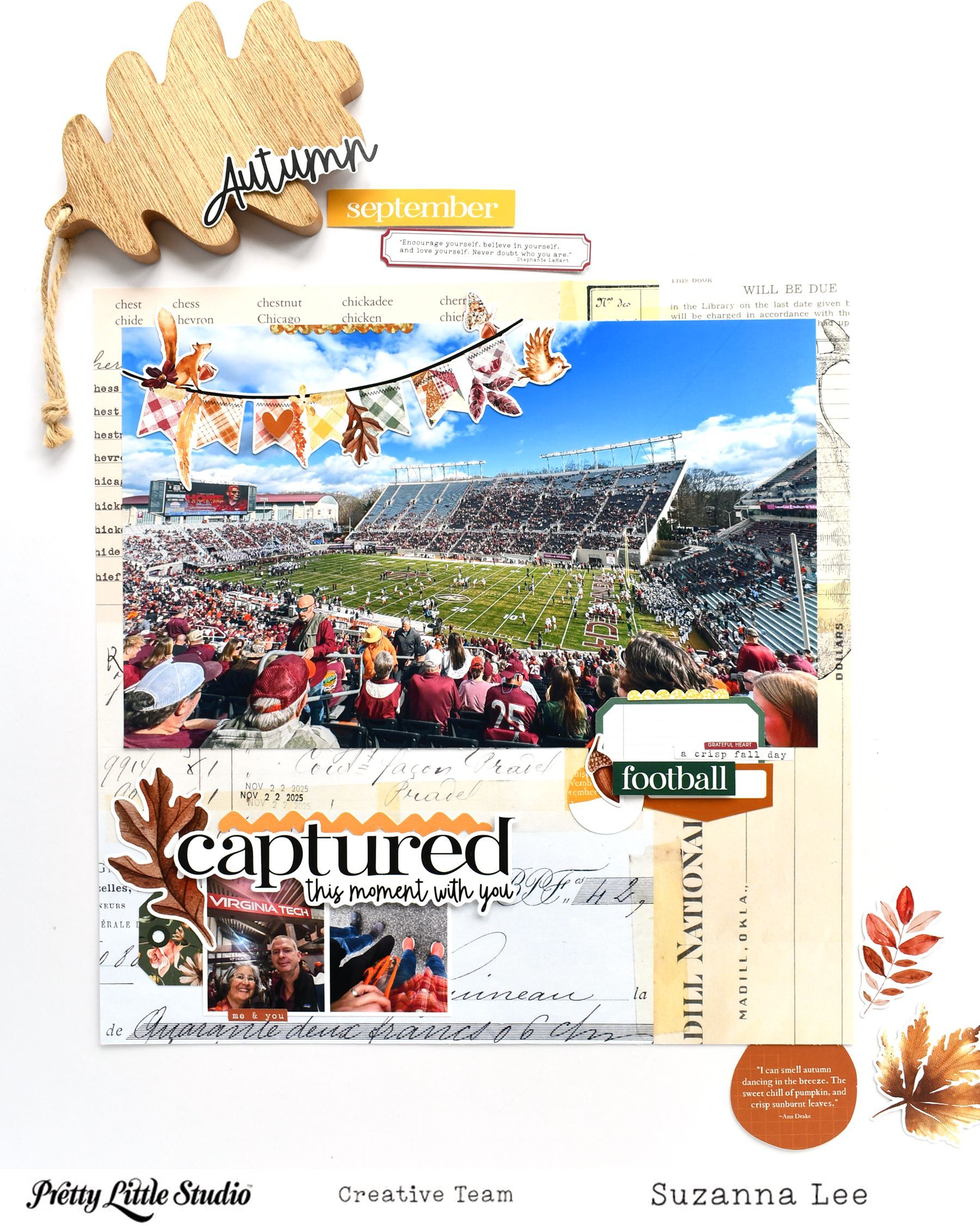
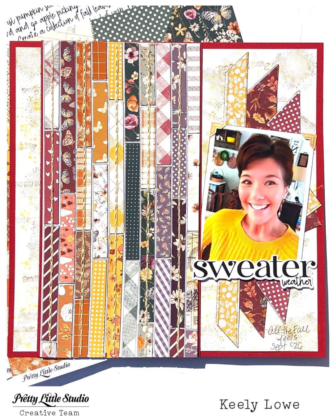
Hello Pretty Little Studio Fans! Suzanna here today to share with you a Fall (or Autumn) layout created using the Ginger Snap collection. Fall is my absolute favorite season so any opportunity I can get to document it, I'll take. With kids going back to school here in the northern hemisphere, it means Fall is around the corner - not much longer now!
Sunkissed Collection and August Texture Challenge
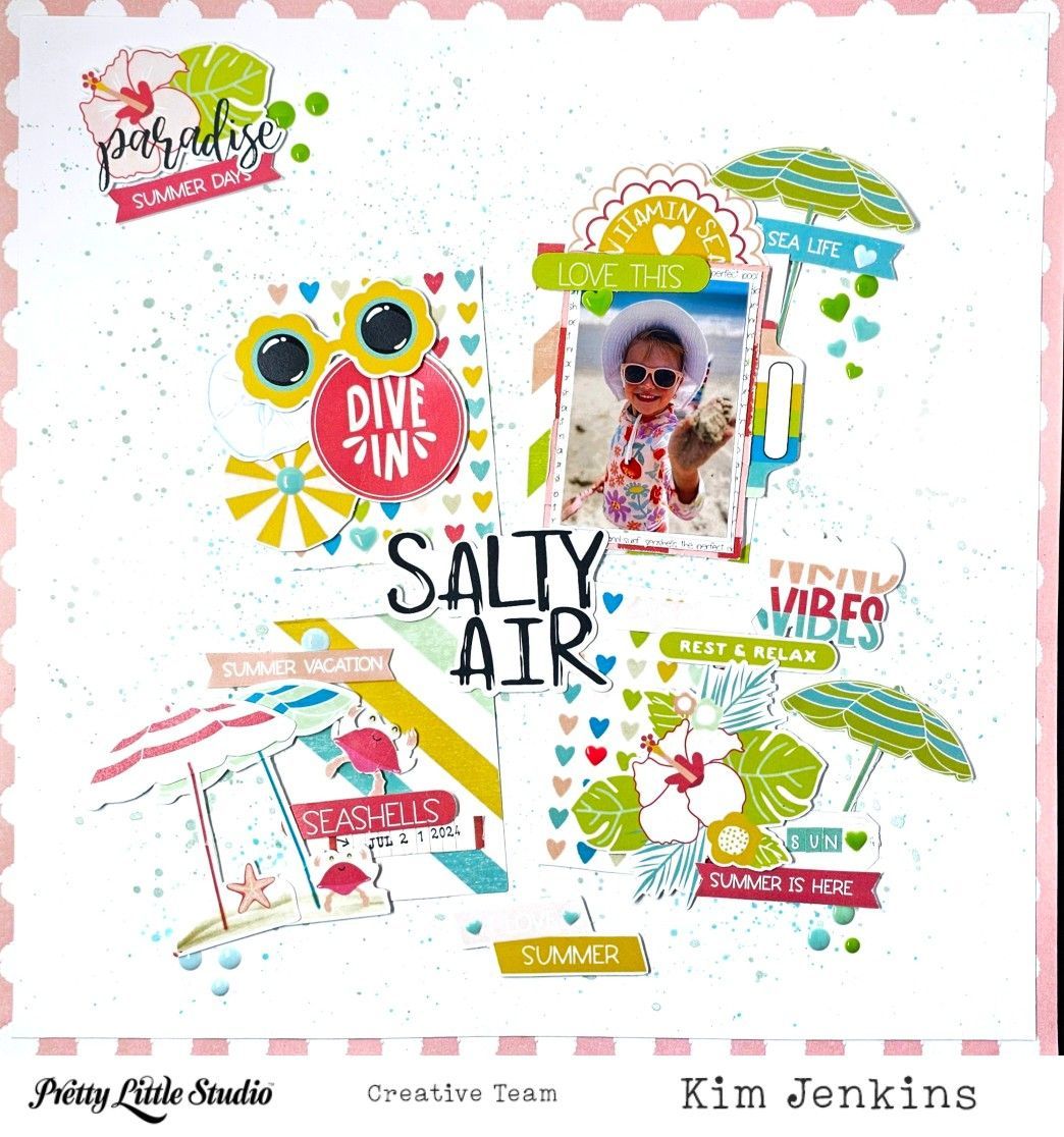
Hi Pretty Little Studio friends, it's Kim and I'm back with a fun summer layout using the fabulous Hey Summer collection. It's the perfect collection for this photo of my granddaughter at the beach.
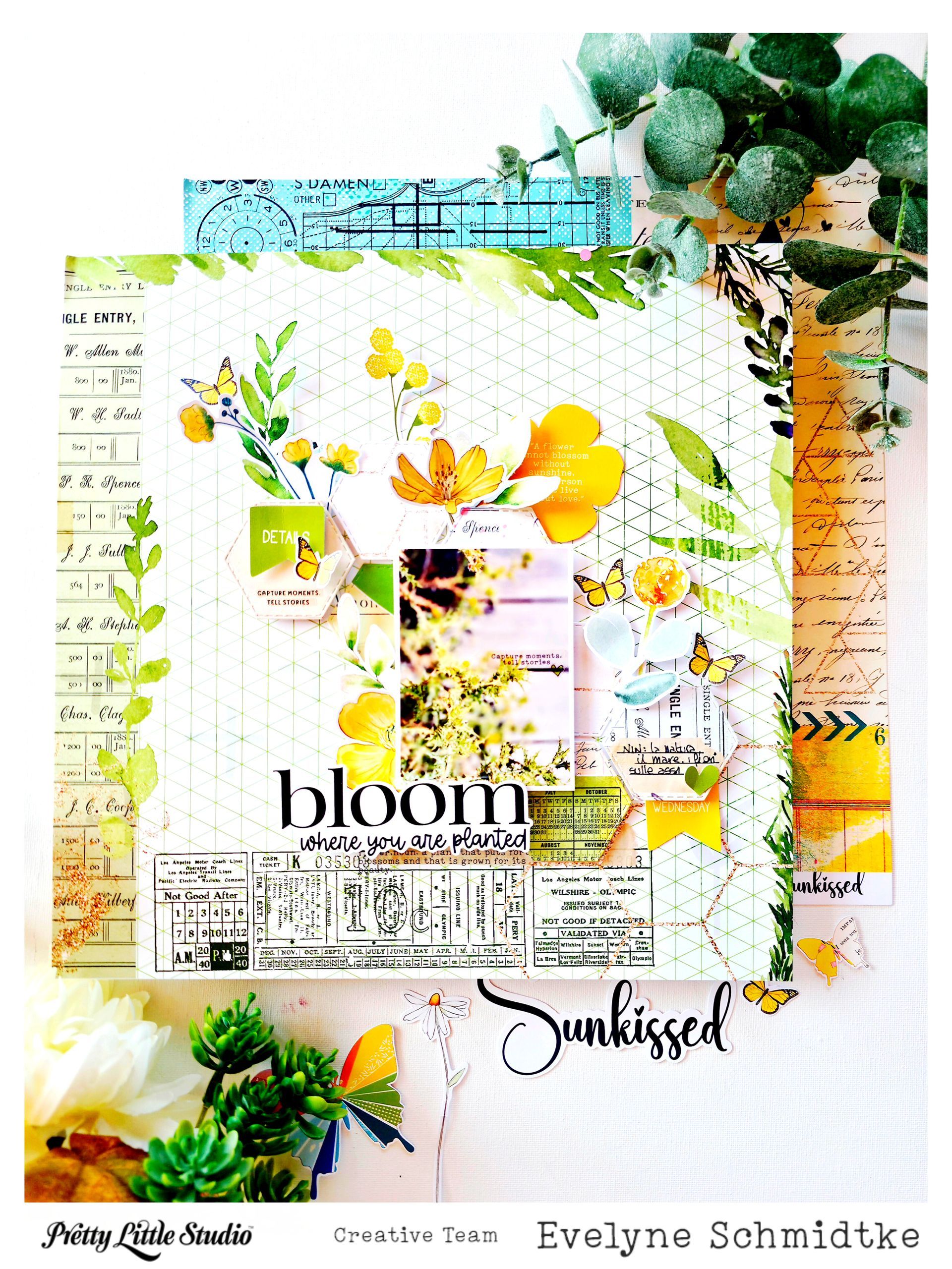
For this month’s sketch, I wanted to create a layout that felt as sunny and full of life as the photo itself. I used the **Sunkissed** collection as my starting point, adding lots of yellow, green and botanical details to echo the beautiful vegetation in my photo. The picture was taken on the little walkway that leads to my favourite beach. The conditions here can be quite challenging for plants — plenty of sun, heat, wind and salt in the air — yet there is always something growing along the path. I loved the idea of celebrating that resilience with the title **“bloom where you are planted.”** It felt like the perfect message for this little piece of paradise. I also wanted to make the sketch work for me rather than simply reproduce it. For the diamond background, I took a little creative shortcut and printed a patterned paper from the **You Are My Sunshine** collection. If you haven't explored the printable designs in the Pretty Little Studio shop yet, they are such a great option when you have a favourite paper or embellishment and don't want to worry about running out. They are especially handy for those of us living outside the US, where ordering physical supplies can mean waiting for international shipping. I carried the diamond shape through the layout again in th e date and journaling details, while the flowers, butterflies and greenery help frame the photo and bring the feeling of the beach walkway onto the page. I love how the different layers create a little garden around the photograph without taking away from the story. For me, this layout is really about finding beauty in unexpected places — and remembering that sometimes, the most beautiful things are the ones that simply keep growing where they are planted.
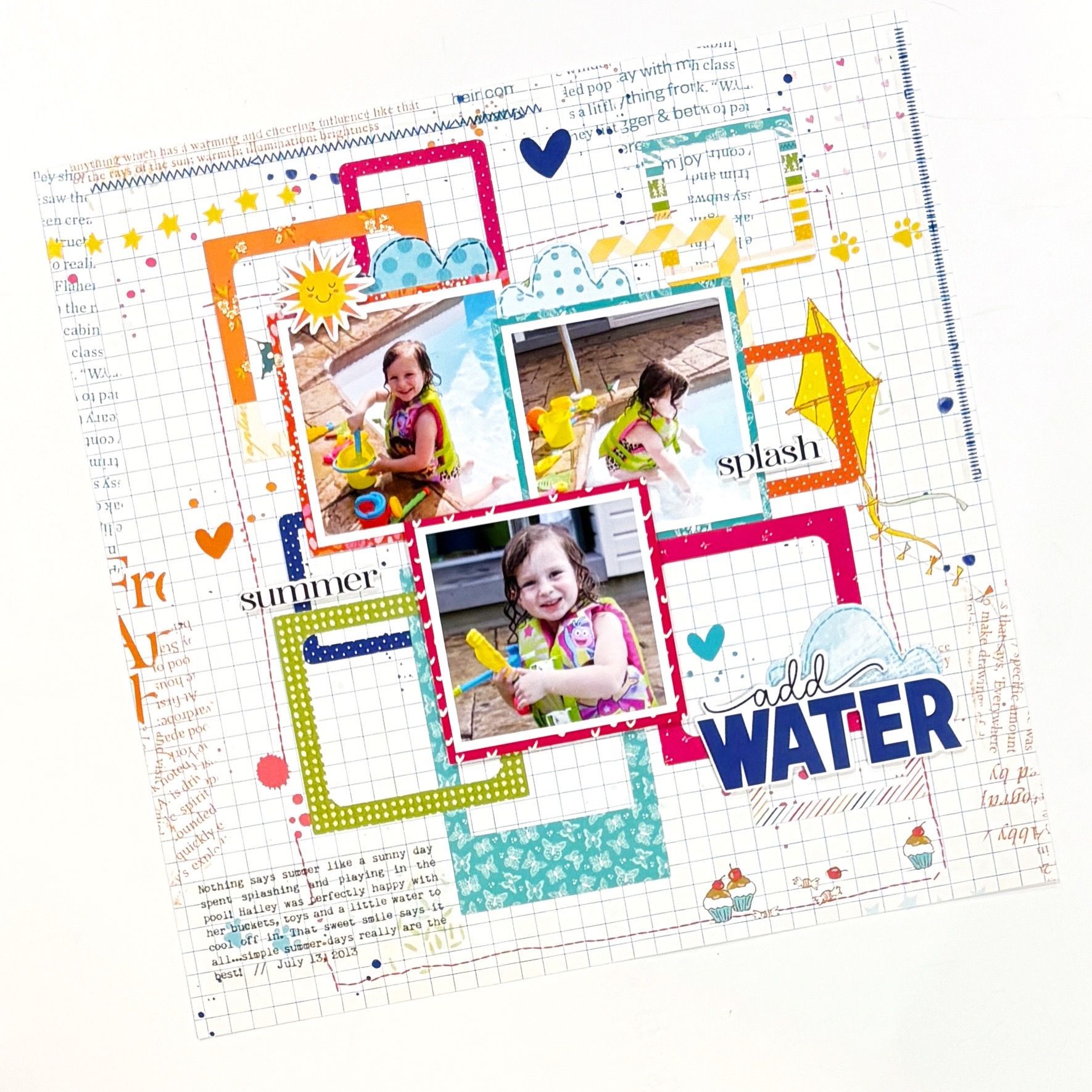
Hello Pretty Little Studio friends! I’m so happy to be back sharing another layout using the bright and cheerful You Are My Sunshine collection! This page features three photos of my daughter, Hailey, splashing and playing in the pool. Her big smiles and wet hair tell the story perfectly, and the playful colors and summertime elements in this collection were such a fun match for these photos.
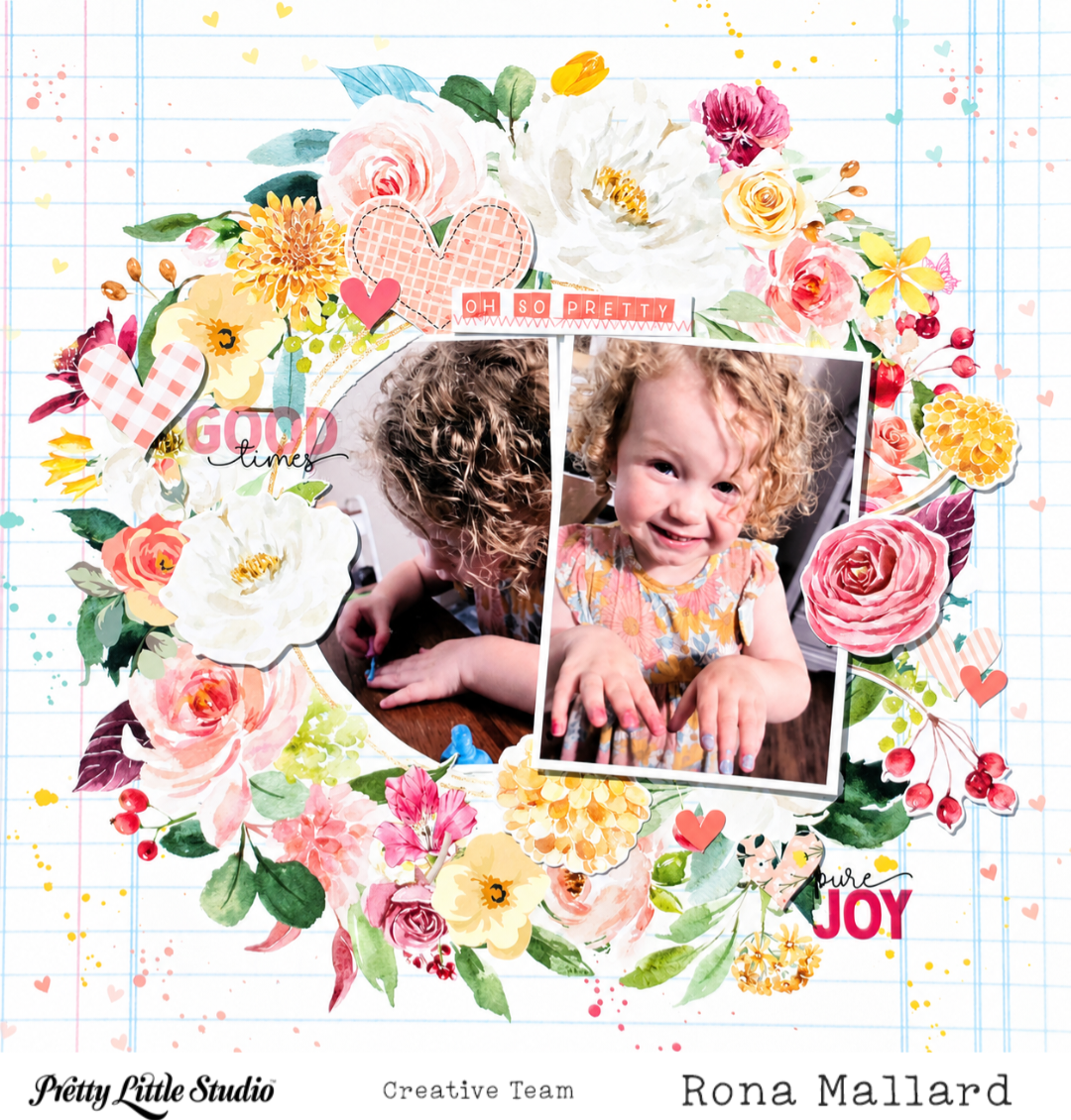
Hi Friends! I have a super easy (so easy it feels like cheating LOL) layout using the Love is Kind collection to share today.
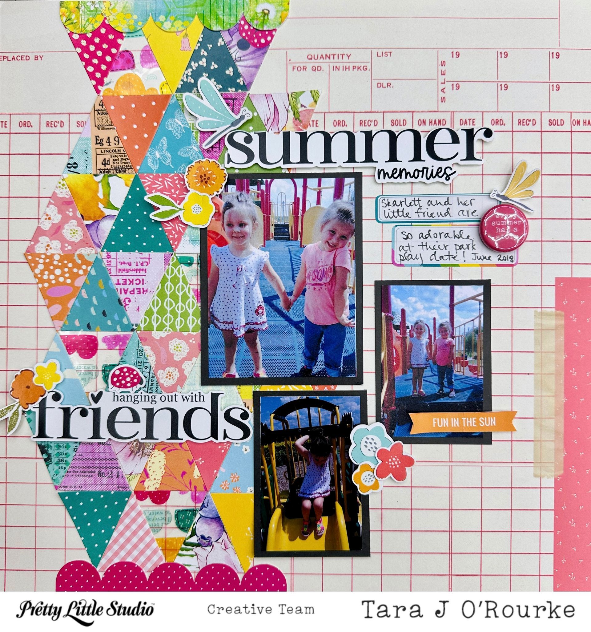
Mixing the You Are My Sunshine and Sunkissed Collections!!!
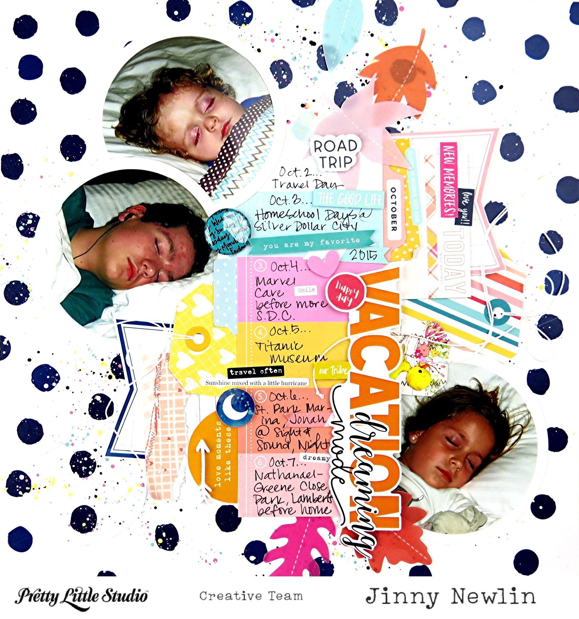
Hey, y'all! It's Jinny here today; and while I'm anxiously anticipating the arrival of the new fall collection, I've put together a page inspired by a menagerie of Pretty Little Studio collections. I've been designing with all of these fabulous goodies now for over a decade, so you'll have no reason to challenge the fact that this layout uses FOURTEEN of those collections. Yes, I said 14! Many of them are no longer available, so I won't be able to link them to current products in the shop; but I'll still put them in italics and hope that they challenge you to use up your own PLS stash and/or simply inspire a design you can call your own. Without further adieu...
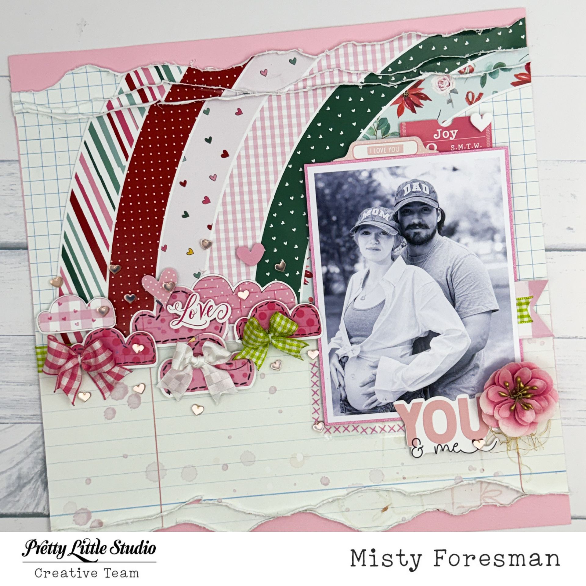
Super Sweet Sugar Plum Collection...
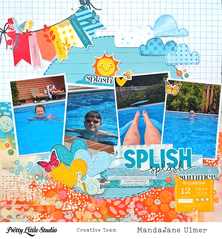
Hey Scrappy Friends! MandaJane with you today. I have a layout for you today, made with the You Are My Sunshine Collection. Am I allowed to say that this is my absolute favorite Pretty Little Studio collection? Because this collection is so colorful and happy. It just feels like ME! And that will always make me want to create. Like I was telling you in my last blog post, we recently went up to Tennessee to have vacation with family. One of the things we did was swim in Aunt Betty's pool several afternoons to try to combat some of that heat! These are some of the photos from our swimming pool afternoons!
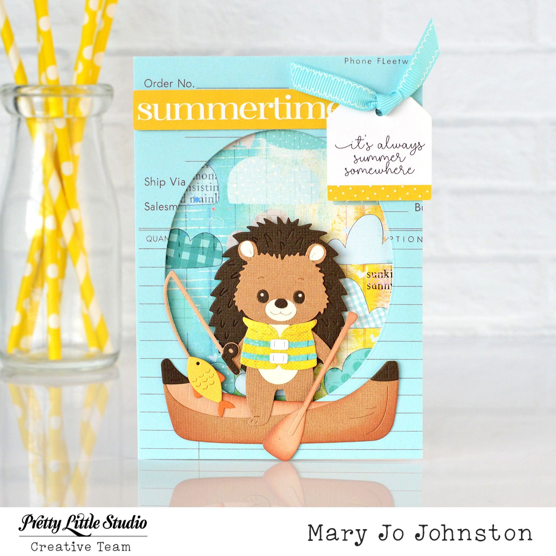
Sunshine & Summer Adventures with Pretty Little Studio There’s something about bright sunshine, cheerful colors, and adorable woodland friends that instantly makes you smile! Today's card celebrates everything we love about summer while showcasing the beautiful You Are My Sunshine Collection from Pretty Little Studio. This fresh yellow and blue color combination is everything we love about cardmaking. The sunny yellow accents paired with soft aqua and sky blue papers create a light, happy palette that perfectly captures the feeling of warm summer days. It's a classic seasonal pairing that is both vibrant and refreshing.
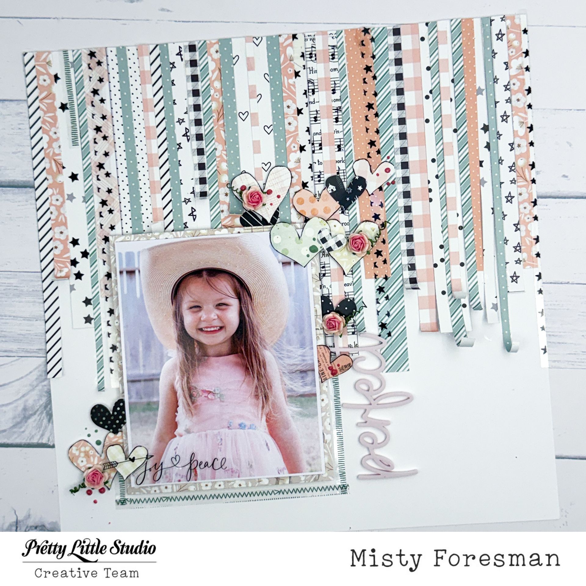
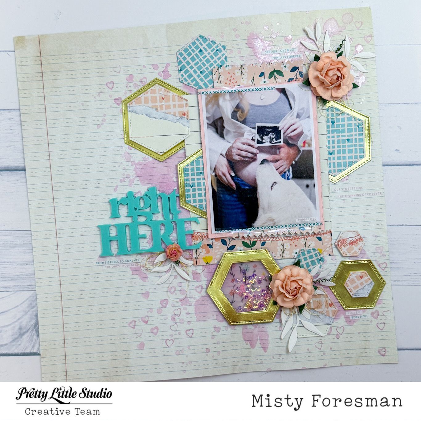
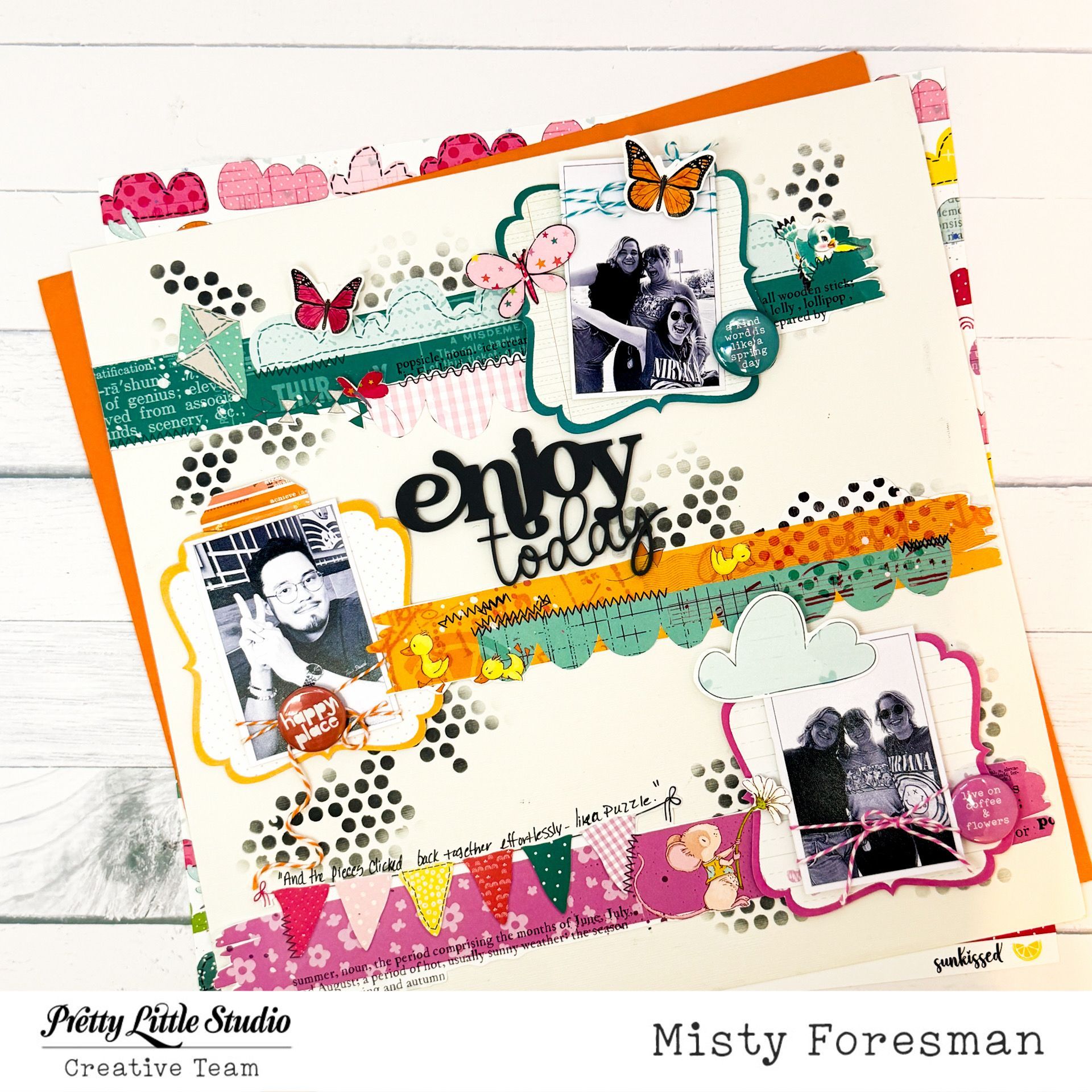
Howdy all my Pretty Little Studio Friends! And Happy Wednesday to you! Misty @mommyofkidz here with you today sharing my take on the August Scraplift challenge! I had the pleasure of lifting my own layout!!! And of course I could not do the exact same thing right??? Well...let's just say that I tried really hard to do it differently while maintaining the integrity...but I absolutely LOVE the Comfort & Joy Collection ...and I could not resist the urge to use it again! I started with my 12x12 collection pack and started sorting through...finding the pages and patterns that I would want to use for my layout.I landed on the pale pinks, mint greens, and go course, black. I do keep my scraps together, so I had plenty of those to choose from also! Once all of my background was covered in my paper strips, I began decorating. I didn't think I needed a lot since there was already so much going on with the background. I simply dumped out my Filled With Love Heart Die Cuts and sorted through for pink, black, and green ones to match. I did choose to have the strips going vertical instead of horizontal...but I did stay pretty tru to the original layout. **Scroll to the bottom to see my original** Y'all, I absolutely adore this photo of my great niece...she is so stinking' cute! I also enjoyed scrap lifting myself! Ha HA! Thank you all for stopping by. I hope to see you over on the Pretty Little Studio Facebook Fans Page playing along with our monthly challenges!

Hi Friends! Today I decided to play along with the August Scraplift Challenge just for fun! You will be able to play along with this and the other August challenges for a chance to win the monthly prize! All of the information is on the Facebook group linked above. This gorgeous layout was created by designer, Misty Foresman.
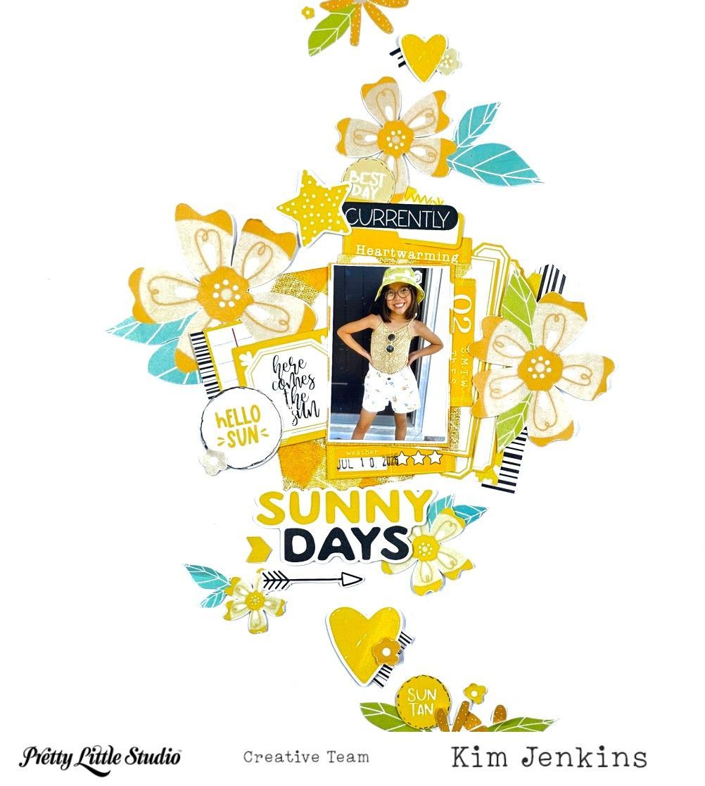
Hi Pretty Little Studio friends, it's Kim and I'm back today with a layout using the fun Hey Summer collection. The yellows and tans in the collection were perfect for this photo of my granddaughter.
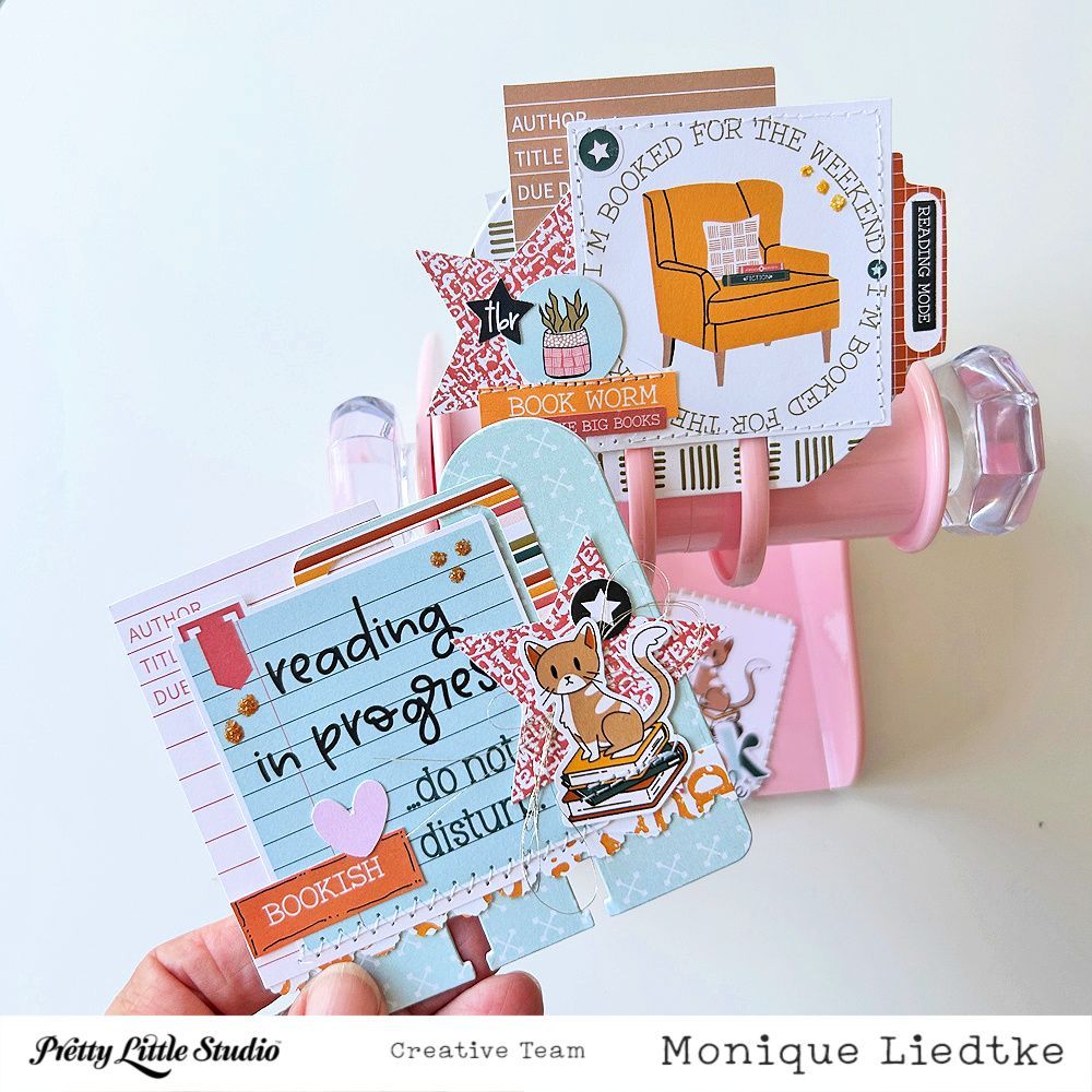
Hello Pretty Little Studio friends! It's Monique here today and I'm sharing two Memorydex cards created with the "Well Read" collection. I love reading and everything connected with books. My hobby is not only reading, but also collecting books, working in my reading journal, updating my GoodReads account (I'm busy putting my library in there so I know which books I can safely buy and which ones are already on my shelves), hanging out in the library and various book stores and visiting book markets. I would love to go on a book retreat one day, but that's one for the bucket list. Here's what I made for today's blogpost: